
There are plenty of articles out there that talk about out-of-the-box A/B tests you can immediately run on your e-commerce site.
Although, with cookie cutter tests, you’re taking a risk. You might be running tests on parts of your site that don’t really need a test right now.
It’s kind of like throwing darts versus strategically moving a chess piece. The chances that one of those test ideas helps solve a pain point that’s happening specifically on your site is very low.
The same goes with any tests you run based off of assumptions or case studies you’ve seen on other sites in the past.
Your visitors are unique. Someone who visits your e-commerce site will behave differently than how they would on any other e-commerce site. That includes your competitors, who sell the same exact products.
That’s why the following 9 A/B test ideas are based on basic UX principles that you can apply and are catered to the experience your website alone provides.
Unfortunately, these aren’t out-of-the-box test ideas that you can run on your site immediately.
Fortunately, these aren’t out-of-the-box test ideas that you can run on your site immediately (see what I did there? ?). These ideas will be specific to the experience you provide, increasing the chances you’ll have a winning variation.
In this post, we’ll cover three common content issues—unnecessary content, missing content, and lack of influence—and apply them to the most commonly visited page types on your e-commerce site:
- The product listing page
- The product detail page
- The checkout flow
Reduce Unnecessary Content
This refers to any content that is distracting, unclear, or downright confusing. Removing it is the easy part. Finding the content that isn’t necessary is what requires work.
First, ask yourself questions as you look at the page. Do a quick heuristic analysis on your own to develop some assumptions on what content might not be necessary. Explore things like:
- Does a user have to stop and think in order to comprehend this view?
- Is there a simpler way to communicate the main point of the page?
- Is there too much information stuffed onto one page or region?
- Are there unnecessary hyperboles that aren’t adding value to the information a user is looking for?
- Are there any elements on the page that are distracting and not adding value to the main subject of the page? Some examples:
-
- Unnecessary promotional banners
- Irrelevant CTAs
- Unrelated imagery
- Exhaustive looking elements (long forms, tables, lists, large blocks of text, etc.)
- Irrelevant associations
-
- Does a user have to leave the page to make any relevant comparisons?
Then, set up some usability tests and ask your users similar questions as they go through the same experience.
- Are there any elements on this page that distract you from your intent?
- Are there any functions that you find unnecessary and would never imagine yourself using?
- Is there any language that isn’t clear or direct?
- Is there any content that you don’t need to know at this point?
- Is there any content that might discourage you from taking the next step?
FYI: You’ll ask these same questions for the product listing page, product detail page, and the checkout flow.
For the following test ideas that address unnecessary content, we looked at some of the most commonly-used e-commerce sites and asked ourselves some of these questions to identify unnecessary content, some of which you might be using on your experience as well.
Test Idea #1: Reduce Unnecessary Content on the Product Listing Page
Here are some common patterns we observed in regards to unnecessary content on the product listing page. Test removing these elements from your site if you provide a similar experience.
Promotions or Featured Deals That Take Up Too Much Real Estate on the Landing View
Your landing view is the most important part of any experience. Not giving users immediate view of what they are there for (browsing through product cards/categories) causes frustration and abandonment.

The Reviews Rating and Count for Non-reviewed Products
This is especially true when you don’t have a lot of reviews on your products in the first place. People will disproportionately choose only the few select products that have high ratings/review counts, leaving the rest of your products by the wayside. Showing no stars, or replacing with a small “no reviews yet” comment might be a better option for that product’s click-through rate.
Distractions in the Product Card Image
Especially when it comes to apparel, you don’t want your model’s shirt to take all the attention when you are trying to sell the pants. Keep the complementary/surrounding visuals neutral so the focus is on the product you’re trying to sell.
Non-pertinent Icons, Links, and Text
It’s easy to want to stuff everything you can onto a product listing page. But some things are better left for the product detail page or even in the checkout flow. Like multiple rating systems, “verified” icons, random crowns, or contact links.
Test Idea #2: Reduce Unnecessary Content on the Product Detail Page
Here are some common patterns we observed in regards to unnecessary content on the product detail page. Test removing these elements from your site if you provide a similar experience.
Busy Navigation and Menus
When you’re users are still browsing categories and product types, it’s acceptable (actually encouraged) to make sure they have easy access to all the navigation items, search boxes, or featured deals.
But when a user gets to an individual product, you want to reduce those distractions so they can focus on the singular subject at hand. The featured deal and banner advertisement below draw attention away from the product and its details.

Unnecessary White/Empty Space in Product Image
Especially for aesthetically-driven products, you want your product image to display trust, quality, and attention to detail. This includes keeping your products featured at the center of your main product image.
Use surrounding white space in a balanced manner, and keep the product in the middle of your users’ view. When you push your product down, as seen below, it reduces a user’s perceived value of the product as it’s “at the bottom” of the image. The way you design the presentation of your product directly mimics the way users perceive it. Plus, in this case, users could see some important details of the product on the landing view instead of having to scroll for it.
Indirect CTAs
You want your users to spend as little cognitive load (AKA thinking juice) as possible to purchase your product. Don’t try to be too witty or clever, especially with your most important CTAs. All product detail pages should have a clear “add to cart” or “buy” call out so users don’t second-guess if they are about to press the right button.

Test Idea #3: Reduce Unnecessary Content in The Checkout Flow
Here are some common patterns we observed in regards to unnecessary content in the checkout flow. Test removing these elements from your site if you provide a similar experience.
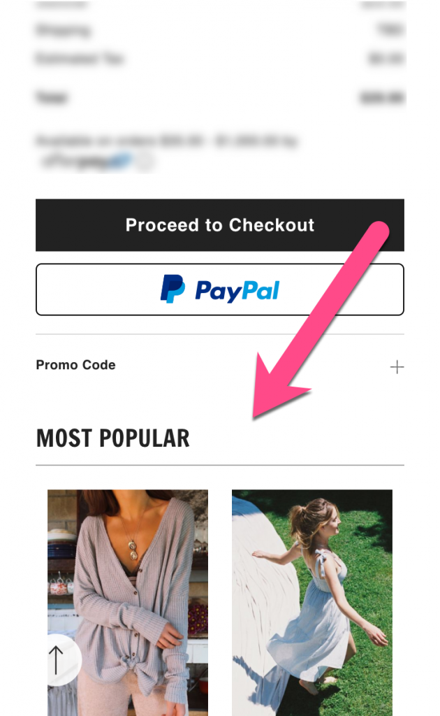
Mentions of Other Products
When a user is in the checkout flow, the last thing you want them to do is to leave. So don’t give them any reason to. When you feature other products (related products, popular, etc.), you are enticing your user to abandon their checkout process and to possibly reconsider making a purchase.
Unnecessary Extra Copy in CTA
As mentioned, your CTAs need to be clear and quick to read. When you combine other actions within the button, it will cause hesitation and users won’t know exactly what that button does right away. In this case, a fix would be changing it to say, “Pay with Credit Card” with a small info-tip below *This includes gift cards.*

Add Missing Content
This refers to any content that a user is expecting to see or would need to see but the experience doesn’t provide it or it makes it hard to find. Discovering missing content follows a similar process as finding unnecessary content: ask questions in regards to your product listing page, product detail page, and the checkout flow.
This process will lean more heavily on asking your users versus developing your own assumptions. There are still opportunities to find the missing content on your own, but it’s going to be more of a guess compared to when you were finding unnecessary content. Try asking your users the following:
- What would you expect to see on this page that is currently missing?
- Is there anything that didn’t have the amount of information that you would want to see?
- What questions are you expecting to get answered on this page?
Test Idea #4: Add Missing Content on the Product Listing Page
Here are some common patterns we observed in regards to missing content on the product listing page. See if your site is also missing similar information and test adding it in!
A Proper Filtering and Sorting View
Make your product listing as easy as possible for users to browse through. Only giving your users the option to sort (as Glossier does in the screenshot below) and not filter makes it very strenuous for them to quickly find what they are looking for.
Consider utilizing a filter and sorting system for users to easily browse your listing page based on product characteristics.

Showing Reviews/Ratings on Product Cards
Ratings and reviews are some of the top factors users consider when comparing products. If you have a rating system in place, showcasing them on the product cards will make it easier for users to decide if they want to take a step further toward that product compared to the others.

Test Idea #5: Add Missing Content on the Product Detail Page
Here are some common patterns we observed in regards to missing content on the product detail page. See if your site is also missing similar information and test adding it in!
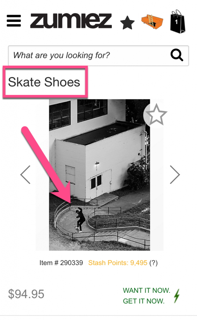
Your Product In Action
For clothing retailers, It is as simple as putting your clothes onto a model instead of laying them out by themselves. In other cases, you might include a video showing people what the product looks like when being used. Either way, you want your visitors to picture what the product looks like as they will be using it so they can picture themselves with it.
In the case below, they should either zoom in on this picture or get the same skater to take a picture much closer up. Or in some cases, showcase a video as Allbirds does.
Context Around Recommended or Related Items
Simply saying “recommended” or “you might also like” when you promote related products does not provide the context a user might find useful. By explaining how you chose that suggested item, you actually make the item seem more attractive. A fix for this, which Amazon does excellently, is explaining things as “People who bought this also bought” or “People who viewed this also viewed.”

Test Idea #6: Add Missing Content in The Checkout Flow
Here are some common patterns we observed in regards to missing content in the checkout flow. See if your site is also missing similar information and test adding it in!
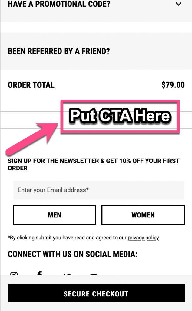
A Clear “Next Step” CTA Beneath Final Price
One of the most common things in the start of the checkout flow is confirming the items and prices. Usually, at the bottom of this details confirmation, is the final price total. If you don’t put a CTA right next to whatever your logical last piece of information is in your flow, it’ll induce frustration in your user and reduce the chances of them completing checkout. In this case, the logical next step is a sticky bar at the bottom of the mobile view. As seen in the screenshot below, when they get to the bottom of the final price, there’s no clear button there to take them to the next step. That sticky bar essentially falls victim to banner blindness since it follows you throughout the whole page.
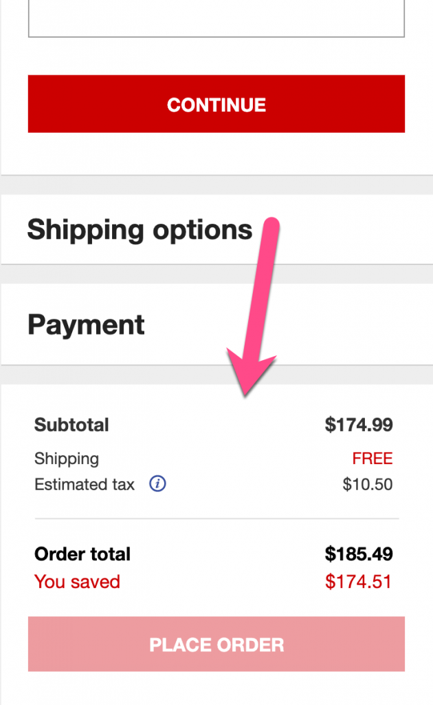
Static Product Info Throughout Checkout Process
This content is a win-win for both you and your users. By providing a static view of the product(s), you are reducing the chance that a user will go “back” to their cart to see what was in it. You also increase the likelihood they will complete the checkout as they will have a constant visual of the product(s) they are excited to get!
In this example, Macy’s is statically showing the costs in their checkout flow. Although, I don’t think any user is “excited” about the cost of what they are buying. By adding product name (and image if possible), it reminds users of the happy ending they are trying to reach by purchasing your product.
Adding Elements of Influence
Now that you’ve optimized the content, you have room to add elements that will make users more comfortable (and more excited!) buying products from you.
Elements of influence include things like trust badges, awards, reviews, partner logos, and so forth.
The goal of these elements is to reduce any anxiety that a person has in regards to their attitude toward your site. In many cases, these elements also serve as validation that your site is trustworthy and reliable enough to purchase from on the regular.
Think of these elements as a seasoning on your main dish. You want to sprinkle the right amount at the right time, but you don’t want to over-season the meal and ruin it.
It’s very important to only use legitimate elements of influence. Using made-up badges or fake reviews will have the opposite effect on your site and greatly reduce the level of trust it demonstrates.
Test Idea # 7: Adding Elements of Influence to Your Product Listing Page
Here are some common patterns we observed in regards to elements of influence on the product listing page. If any of these scenarios apply to your site, try testing them!
Create “Trusted Seller” Badges
For e-commerce sites that serve as a platform for multiple sellers, users have a second layer of trust they need to apply. Help them reduce that cognitive load by assigning recognizable badges to your most reliable sellers or distributors. eBay does a good job of this below, but they don’t explicitly call out what “Top Rated Plus” means. Also, when a user navigates to the product page, that badge just disappears.
After some Google searching, we discovered that it was awarded to the sellers with the best customer service.
An easy fix here would be to rename the badge to “Highest Rated Sellers” or something more clear and to showcase this badge on the product page as well.

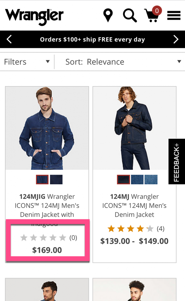
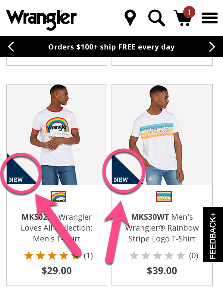
Indicate Product Characteristics on Product Cards
Products all have characteristics that play a significant role in a person’s motivation to buy them. These include things like products that are on sale, top sellers, new, most reviewed, and so forth.
These characteristics will help influence your user to click into a product and give them valuable information at the proper step in the eCommerce journey.
The example below from Wrangler does a good job in indicating “new” and “top selling” items, but they don’t have any of these badges for products that are on sale. An easy fix would be adding a “Sale” badge on the appropriate products (especially considering many people look at sale items first).
Test Idea # 8: Adding Elements of Influence to Your Product Detail Page
Here are some common patterns we observed in regards to elements of influence on the product detail page. If any of these scenarios apply to your site, try testing them!
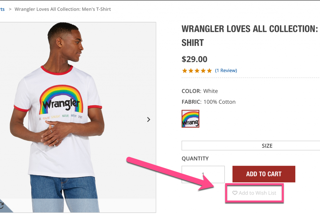
Include Other Shopper Behavior
Social proof is a very influential concept when it comes to e-commerce decision making. If there are micro-actions users take on a product (besides adding to cart) that indicate positive sentiment, share that information with other shoppers.
For example, if you have a “favorite” or “wishlist” functionality on your site, showcase how many people added a product to it. This helps people understand that “other shoppers find this product appealing.”
In the example below, Wrangler does have a “wishlist” functionality (which is oddly hidden), but they don’t have social proof of why this product is valuable from the perspective of other shoppers. A simple fix here could be “130 other shoppers added this to their wishlist today” or “1,200 other shoppers viewed this product in the last hour.”
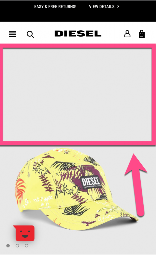
Reviews, Testimonials, or FAQs
Right back to the social proof again. The most influential thing someone could ask for when shopping is to hear from people who actually bought and used the product.
Some e-commerce sites might not have the volume to have reviews for every single product they sell. Even if that is the case, you can still include FAQs for that category of product.
In the below example from Diesel, this product page has no social proof in any regard. Some helpful FAQs here could be about fit, shipping, color, or any other common questions real customers have asked in regards to jeans in general.

Test Idea #9: Adding Elements of Influence to Your Checkout Process
Here are some common patterns we observed in regards to elements of influence in the checkout flow. If any of these scenarios apply to your site, try testing them!
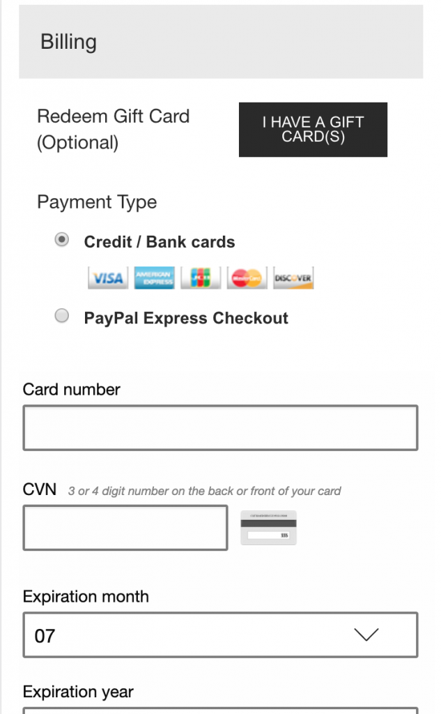
Information Security (Trust) Badges
It’s much less stressful to input your credit card number when you know it won’t be compromised. Without any mentions of security or badges that communicate a safe checkout, users don’t have any way of trusting you with their information.
That’s why trust badges are so important to your checkout flow. The below example is the screen that a user would input their credit card information, but there isn’t one icon or element that is communicating about the safety of their information.
*Here’s a great rundown on the potential impact of security badges and which ones are most effective.
Company Guarantees or Refund Policies
The best way to avoid buyer’s remorse is to get ahead of it. You can address these things ahead of time by showcasing customer-focused refund policies or quality guarantees in your checkout flow. This reduces any (and all) risk a user might be experiencing during checkout. Presenting these in a clear, comprehensive way (with no fine print exposed) is definitely worth testing.
The example below, from Target, doesn’t present any anxiety-reducing policies or guarantees. For big brands, who can afford to compensate customers when things go wrong, this should be the norm.

You’re Ready to Start Testing!
Now you’ve got at least 9 A/B test ideas (that will be custom to your site specifically) to run with. And if you ever get “writer’s block” when trying to come up with test ideas, just remember these three concepts and see where they can be applied on your site:
- Reducing unnecessary content
- Adding missing content
- Adding elements of influence
Cheers!


