By the e-book: $7
Buy Online: $19.95
When you hear an entertaining speaker, or have a conversation with someone who holds your attention, what is it that keeps you listening? Probably a few things:
Conversations have a certain flow. And that flow isn’t necessarily linear. Sure, you say hello, talk a bit, and then eventually say goodbye, but in between a discussion can meander down a lot of different paths.
If you tried to sketch out a conversation between two people at a networking event, it might look like this:
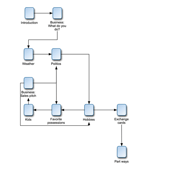
People tend to jump from one subject to the next, but they always have a goal in mind. If you’re at a networking event, let’s face it: you’re there to make good business contacts. You know that you want to meet potential clients and vendors, and exchange cards. But how you get from an introduction to a business card is likely to be different every time.
A web site must treat content the same way. It may all be “static” information on a page, but visitors will move from the home page to their goal (which may change) in many different ways. Great web sites include great information architecture. To me, that’s the practice of providing clean, useful, practical routes between nuggets of information, where those routes anticipate common lines of inquiry.
I always assume there are a few basic types of users. Browsers want to click through a site, finding what they need by using buttons and doing as little typing as possible. Searchers want to get to your site, type in a phrase, and go directly to the page they need (or start on Google and do the same thing). Navigators want to see a site map or other high-level view of your site, find the area that’s relevant, and go there.
Your site needs to cater to all three audiences without playing favorites. That’s the other side of good information architecture: structuring content so that your audience gets to pick their own route through it, while at the same time content subtly steers them so that the right parts of your message receive emphasis.
I can’t give you any great rules for information architecture — it’s as much art as it is science — but here are a few guidelines:
When I put on my architect’s hat, I work using a site map — it’s a flowchart-style outline of how I’ll organize site content, and it serves as a clear picture of the possible conversations I can have with my site visitors.
In other words, information architecture means making sure everyone can find the stuff they want, with a minimum of fuss. It means clarity.
Information architecture and visual design go hand in hand. Where you put stuff on the page provides emphasis and a sense of organization that necessarily back up the architecture. I usually do architecture during the initial design phase, so that I can make sure the two work together. It’s a little out of order here — I’d usually do the site map first, then the visual design. But it makes more sense to have it here in the context of this book.
Just before Morgan creates the design for her site, she starts pondering architecture.
Morgan knows the basic information she wants to communicate, and she knows what her calls to action are (see how important that initial work on personas was?), so she creates her site map:
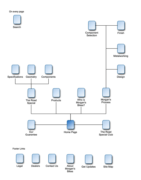
This map works. It’s structured well, so that visitors can immediately learn about her main product — the Road Special — and wander through the site to learn more about her company as well.
Note that she’s provided a link to Products and another directly to the Road Special, from the home page. Right now the Road Special is her only product. It makes sense to minimize the number of clicks required to get there and to keep options open for the day that Morgan’s Bikes has a whole line of products.
The footer links are links available from every page on the site
— they may not be in the footer, but that’s my personal notation for secondary links that should nevertheless be universally available. They answer questions that may come up at any time in the conversation, just as someone might ask you for your card at any time during that networking event.
You can get from any one page on Morgan’s site to any other page in just a few clicks. So this site map accomplishes some important goals.
Most site maps will be far, far more complex. Here I’ve kept most site pages out of it, for the sake of your eyesight. This site map is a great foundation for Conversation Marketing. It doesn’t force anyone into a particular conversation.
Instead, it enables visitors to follow their own path through the information, but offers just enough guidance to make sure they don’t get lost.
With a complete design and information architecture, it’s time to start building the site. Which brings us to the next step.
Imagine talking to someone who has great ideas but just can’t get them across. You can almost feel the brilliance, but you can’t get at it because of the background noise. It’s frustrating, right? On the internet, good code is part of how you build a good conversation. If your site isn’t properly coded, it may not look right, and your conversations will be short.
Visit any web site. Then, if you’re using Internet Explorer, click View > Source. See all of that gobbledygook? That’s the HTML code that makes the page look the way it does.
HTML (HyperText Markup Language) is a language of structure. It lets a web page designer organize content into paragraphs, tables, and the like. It also includes several ways to control how stuff looks — you can control the font, color, and size of text, place images on a page, and do a whole bunch of other prettifying.
People have been trying to improve HTML since the advent of the World Wide Web. It’s a very imperfect language, particularly when you’re trying to make a really attractive, usable web site. For example, HTML forces designers to use tables — originally meant for the presentation of tabular information — as a layout tool. It also often forces designers to use pictures of text, rather than real, cut-and-pasteable text. It’s easy, then, to build a web page that looks OK in many web browsers, but has a terrible, sagging foundation of messy, noncompliant code.
Very few web sites I visit are built on good code. Many print design or web design professionals who are building web sites often cut corners by using a visual layout tool (think Microsoft FrontPage or Macromedia Dreamweaver). After all, no one sees the code. As long as the web page looks OK, who cares?
You should care. Bad code is a conversation ender that creates a whole host of problems. A web site built on bad code:
It’s as though you’ve faked knowledge on a topic. Sure, you can probably scrimp on your homework and get away with it for a while, but eventually someone who knows the subject is going to find you out. It’s tough to recover from that kind of gaffe, right? The same is true if someone visits your web site and it appears broken. Even worse, what if a search engine visits your home page but finds what appears to be an attempt to “cheat” by tricking the search engine into awarding a higher ranking (see chapter 7, “Brag Modestly”)? It might be an honest coding error, but many engines will ban sites attempting to game the system. No recovery.
Think of good code as a solid foundation. Use it, and everything you build afterward will be easier. A web site built on clean code:
No one notices good code, just like no one notices if you speak clearly. Good code means good Conversation Marketing because you don’t sound silly, and as a result, you sound smart.
At the time of this writing, “good” code has the following attributes:
The easiest way to accomplish good code is by using a combination of HTML, XHTML (Extended HyperText Markup Language) and CSS2 (Cascading Style Sheets, version 2).
I’m not going to provide a lesson in XHTML hybrid programming here. If you want to learn it, check out Designing with Web Standards, by Jeffrey Zeldman. It’s a fantastic book, written in plain language.
Chances are, though, if you’re reading this book you are someone who’s going to hire a web designer, or supervise one, who will then build your site. So how do you make sure that the code they’re writing is good?
It’s not that hard. Here’s a checklist of dos and don’ts that you can use to ensure your site is built on solid ground.
Do use cascading style sheets. Ask your web designer about this. If they give you a blank look or say they won’t use them, fire them and find another. Repeat as necessary.
Do separate style from structure. Your HTML page should manage structure by defining paragraphs, heading levels, bullets, and the like. It can even do some rudimentary formatting using tables. But font styles, colors, line height, and everything else should be managed in a cascading style sheet.
Do make sure your site works in most browsers. Install Mozilla Firefox (you can find it on Google) and a recent (6.0 or later) Netscape on your computer. Mozilla, in particular, is a stickler for web standards. Test your web site. Your site doesn’t have to look 100 percent the same in all browsers, but it should be close. If the page you’re viewing looks broken in some browsers and fine in others, it needs to be fixed.
Don’t do every page differently. If your web site uses one basic layout throughout, you should be able to use the same code throughout, too. View the source code of two different pages. Take a quick glance: do they appear to be structured about the same? You don’t have to know HTML to check this. Just see if the same gibberish shows up, in about the same places, for the first 20 to 30 lines of the source code. If it does not, again, talk to your designer and find out why.
No examples in this chapter. What do I look like, an HTML professor? But if you want to learn a lot more about standards-based HTML coding, buy, borrow, or steal a copy of Jeffrey Zeldman’s Designing with Web Standards.
Ever had a miserable customer experience, but walked away smiling? The lousy dinner that was followed up with free dessert? The terrible phone service that was compensated by two months free? How about a free first-class upgrade after your flight was delayed?
Why did you walk away happy? The meal sucked. The phone company drove you nuts. And you got to your destination nine hours late, after eating lousy airport food. You walked away happy because someone said, “We’re very sorry, and here’s how we’re going to make up for it.” They expressed concern, and yeah, they bribed you.
You can do the same thing on your web site, through a technique called contingency design — the Zen art of admitting things will go wrong and figuring out how to apologize, in advance. Contingency design is essential if you want to sound smart. Because no web interaction can be perfect, and it’s up to you to help your audience walk away smiling.
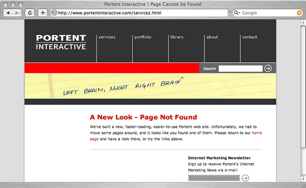
Page Not Found. Morgan now has a web guru working on building her site. Problem is, the new site is going to replace an existing one. Folks may have bookmarked pages on the old site, or they may follow outdated links to her site from other web sites or search engines. If a potential customer does that, what will they see?
Well, if her web developer failed to practice good contingency design, they see an ugly, generic 404 Page Not Found message that begs them to go away and never come back. That conversation didn’t even get started.
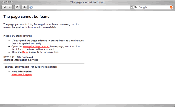
A bad “page not found” error. Not very informative, is it?
If, on the other hand, Morgan’s web pro engages in just a little contingency design, they might see a nicely designed, useful page. Here’s how my company’s site deals with the problem.
Much better. The user didn’t find what they wanted, but at least they’re not lost.
This error page provides navigation, clear indication that you’re in the right place, and instructions on what to do next. The conversation continues.
Where the heck is…? A visitor to Morgan’s site uses its onsite search tool to find “wheels.” But she types in “weels” — maybe she had too much coffee. Bad contingency design yields a “Sorry, no results found” and relies on the visitor to figure out what happened. Good contingency design shows a page that says something like “We didn’t find anything for ‘weels,’ but we did find results for related terms. Here are the top 10 results.” All fixed.
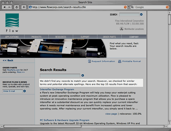
Search tools should help if the user misspells a word.
So a little forethought helps the visitor find her way past those inevitable little mishaps, and respects her interest in your message.
Good contingency design means always having to say you’re sorry, but never having to say “See you later.” If you want to learn more about contingency design, check out Defensive Design for the Web, by 37signals (Matthew Linderman and John Fried). It’s a definitive work on the subject.
All of my chattering on about code, architecture, and contingency design may make you think that content — that stuff people actually see — isn’t important. Not true.
I’ve spent most of this chapter talking about how your web campaign will speak. But what it says is more than half the battle.
Written content must be crafted to speak to your audience; go back and look at your list of personas, and make sure that your text content really works for the lowest common denominator in that group.
Images, streaming video, and any other content on your site has to be accessible to that audience, too. If your audience is using dial-up internet and six-year-old computers, sending them streaming video probably makes no sense. And the content of those images and rich media content matter, as well — one visitor’s entertainment is another’s insult. Always consider the mores and quirks of your audience.
Now you’re saying, “Four paragraphs? That’s it?”
Yes. That’s it. Because well-crafted content is a subjective, subtle, tricky business. Trickier even than design. If you want to succeed, and you’re not comfortable producing your own content, get a pro. But here are a few basic rules of online content.
A good conversation gets to the point and holds everyone’s attention. Conversation Marketing does all that, and more. Sound smart and you’ll have more internet conversations and more customers.
This was a long, challenging chapter. The good news is, you made it! The bad news is, you’ll have to read it again and again, and read the other materials I’ve referenced, and spend a few hours per day researching the latest developments, if you want to consistently produce good content, organize it effectively, and then deliver it using a site that’s based on web standards and good contingency design.
If you’re a web pro, or want to become one, that’s exactly what you should do. Become a student. Live and breath this stuff. It pays off.
Happily, if you’re not interested in becoming a web professional, you don’t have to do that. Use this chapter as your guide when you plan, supervise, and then evaluate the professionals you hire. This chapter is a great yardstick with which to measure those who do the work for you.