
White space, also known as negative space, is one of the most vital design principles in modern web design. It’s also one of the most complicated usability elements to nail down. If used well, users can immediately notice important information on any given interface. But if used poorly, users may need to work harder to find what they need.
It’s important to note that there’s more to white space than just aesthetics. White space is not actually white; it can be any color, pattern, image, or shape. It’s also not an “empty” space. White space creates intentional negative space between user interface elements such as text paragraphs, imagery, buttons, and forms to ensure that each element is legible.
To understand how white space impacts user experience, we must first understand its purpose and origins, starting with the rise of minimalist art.
What Is Minimalism, and Why Is It Trendy in Web Design?
Minimalism was an art and music movement that began in the U.S. in the late 1950s and continues to play an important role in today’s digital and physical design spaces. While its predecessor abstract expressionist art embraced intense colors, spontaneity, and improvisation (think: Jackson Pollock), minimalism strives to achieve simplicity, order, and harmony by utilizing geometric shapes and monochromatic palettes.
Today we see and use minimalism’s concepts everywhere, and it’s even become a lifestyle. In 2015, Nielsen Norman Group analyzed 112 minimalist websites to identify some of the common characteristics of minimalist web design. They found over 90% of minimalist websites had flat patterns and textures (not using gradients or shadows to appear three-dimensional) and used limited monochromatic color palettes. Over 80% of the sites had minimal features and elements (including menu items, images, and links) and featured maximized use of negative space.
Embracing “Less Is More” In Web Design
Minimalist art was influenced by the famous German art school, Bauhaus, which focused on design functionality and inspired a generation of designers and artists to craft useful and beautiful objects.
The unofficial minimalist motto, “less is more,” is widely attributed to one of Bauhaus’s owners and famous minimalist design architect Ludwig Mies van der Rohe.
In web design, we achieve less with more by not overwhelming users with options. In other words: by presenting users with less, we are helping them achieve more.
Principles of Minimalist Web Design
There’s a range of minimalist design guidelines that offer best practices around the use of typography, gridlines, graphics, imagery, and of course, white space. To keep things simple, know these three core principles of minimalist web design:
- Keep only the essentials: Include the most vital pieces that are important for the core use of your product or design.
- Focus on function and usability: Your product’s content and design systems should work cohesively to create a seamless user experience.
- Make it simple and clear: Use white space, flat patterns, and contrasting colors to draw attention to foundational elements such as headings and call to action (CTAs).
What’s the “Right” Amount of White Space in Web Design?
White space is key to both usability and design: But when does white space become too much that it’s harmful to user experience?
In Jesse James Garret’s book The Elements of User Experience, he notes that “one of the most complicated parts of designing web interfaces is figuring out what should stay and what should go.”
Though there isn’t one “right” way to approach this quandary, there are five steps you can take to figure out how much white space will best aid your users’ experience across your site.
1. Highlight the Most Important Elements
White space is used to direct users’ attention to the most important contents of a page: The information your users need to achieve a task or a goal.
To discover what your users care about most, answer the following questions:
- What is the first thing a user is looking to find or do on this page?
- Where on the page would the user expect to find the information they need?
- Where on the page would the user expect to complete a specific task on the page?
2. Prioritize the Top of the Fold
The top of the fold is the welcome mat of every page, making it the most important real estate in your design.
If there’s too much white space at the top of the fold, users may not be compelled to scroll to find what they need. However, if there’s too little white space on the top of the fold, users may feel overwhelmed and quickly bounce.
Before adding or removing white space to the top of the fold, consider the following:
- Without scrolling beyond the fold, can users tell what the page is about?
- Without scrolling beyond the fold, do users have a clear idea of what task they can achieve on the page?
The information at the top of the fold should always be self-explanatory, including the global navigation labels. Make sure you’re using descriptive and clear language across all labels and CTAs. Don’t leave your users guessing!
3. Focus on Findability
When treating unique elements in relation to one another, follow the law of proximity. The closer elements are—the less white space there is in between elements—the more they’re perceived as related to one another.
Before adding or subtracting white space around a specific element, consider whether the additional space will help users quickly locate the information as they scroll through the content on the page. Remember, not all elements have the same level of importance to your users.
Let’s take a look at Costco Optical’s use of white space. We can assume the goal of this page is to show users what type of products Costco Optical offers and help users shop for and purchase lenses. The following image shows a mobile view of a section of the page:

The CTA button to “Find The Nearest Costco Optical Location” uses very little white space in between the CTA’s text, the blue background rectangle, and the header “LENSES.”
As a user scrolls to look for what type of lenses Costco Optics offers, the user could easily miss the header “LENSES” as it’s grouped closely below the CTA button. Additionally, the horizontal line break placed below the header “LENSES” may indicate to users that they missed the section they were looking for or need to continue scrolling to find what they need.
The following image shows the same section of the page on desktop view. The CTA’s text is centered, and unlike the mobile view, there’s plenty of white space between the CTA’s text, the blue background rectangle, and between the header “LENSES.” The line break is also above the header, indicating to users that this is a new section.

Additionally, on desktop, the header “LENSES” is followed by images of different types of lenses. On mobile, these images are hidden, which may hinder the user experience if they miss this section and need to look elsewhere for types of lenses.
To avoid making this mistake, remember to always design for mobile before desktop and ensure the users’ experience is treated equally between various devices.
4. Test Your White Space With Users
If you’re unsure about how much white space to add around an element, a quick user test you can do is ask a colleague or a friend to accomplish a task using your design.
As they go through the steps, have them talk about their experience. How long did it take them to find what they needed? Were there any friction points where they were unsure of what to do or where to look for information?
You don’t need to have a big budget for user testing. Watching a few people go through your web design can help you identify where the findability of elements and information falls short.
5. Use Data to See Where Users Are Most Engaged
A data-backed method to determine if white space is hindering user experience is to use heatmapping tools to track users’ engagement across your site. Heatmaps are a great way to see how far users scroll down a page, what they’re clicking on, and their mouse movements.

Tip: If a CTA on your page with a lot of white space around it is receiving little user engagement, you may want to consider adding more descriptive text, headers, or imagery around the CTA to help draw the user’s attention to it.
Example of Poor Use of White Space
Let’s take a look at Eye Doctor’s Optical Outlets, an e-commerce site and a chain with over 50 stores across Florida.

On mobile, the information above the fold doesn’t show users that Eye Doctor’s Optical Outlet offers contact lenses, eye exams, and other types of lenses for women, men, unisex, and kids.
To improve the use of white space, Eye Doctor’s Optical could make the hero image larger and include additional CTAs along with the blue “SHOP NOW!” button.
Good Examples of White Space
The following example from Warby Parker shows good use of maximizing white space above the fold while incorporating key links and CTAs for users to shop for different types of glasses and contacts.

When adding white space through stock imagery, be sure the images don’t require users to search elsewhere or scroll further down the page to find the information they need.
Target Optical’s lenses page is another good example of white space.

On mobile, the white space between the red toggle switch from eyeglasses to sunglasses and the list of eyeglass types doesn’t create additional scrolling for users beyond the page fold. There is also equal treatment of white space between each drop-down menu, making each element equally findable to users.
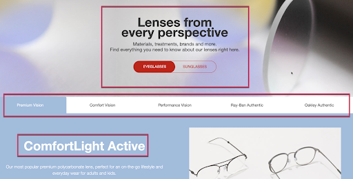
On desktop, the full-width background image of the hero banner acts as white space. White space helps draw users’ attention to the page headings and the red toggle switch between eyeglasses and sunglasses.
This is a good example of a minimalist design that utilizes shapes and colors as white space to frame headings, links, and buttons.
Tackling White Space on Your Current Website
If you learned one thing from this article, I hope it’s that white space is a necessary tool that should be treated with care. White space and usability go hand-in-hand, and we must look carefully at how each design affects users’ ability to accomplish their goals.
When analyzing the white space on your website, start by looking at high-engagement elements of each page, such as CTAs, links, navigation, menu items, and forms. Use web analytics and heatmapping tools to gauge user behavior across your site, and use these insights to enhance the information above the fold.
While your minimalist design might be edgy and modern, functionality is far more important for your users and customers than looks.
In the words of Donald Judd, an American artist and renowned minimalist designer: “Design has to work, art does not.”


