
Accessibility for the web is not a new subject. However, the topic of web accessibility is growing in volume. That very fact may be what led you to this article; you need or want to know about accessible content practices but already see the topic is wide and deep.
I want you to be able to shout about the importance of accessible web content along with us and everyone else. This guide is aimed at practitioners who are newly aware of accessibility concerns and need a practical, prescriptive place to get started. Having a general grasp of HTML and page structure will be helpful.
How to Use This Guide
This article covers a small set of general accessibility issues that are part of Web Content Accessibility Guidelines (WCAG) compliance. I will point them out and explain them, provide insight on how you can resolve these issues, and offer my professional opinion on how these issues make it into our applications or websites in the first place.
To be more specific, nearly all of these issues can be flagged using tools such as AXE by Dequeue, webAIM’s WAVE Accessibility Tool, or the Audit tools in Google Chrome. Any items that you cannot find via a tool, I will call out directly and provide context on what to look for.
Screen Reader Use in Examples
One last point before we get started. Some screencaps in this article will show the Rotor menu from VoiceOver, a screen reader bundled with macOS. If your curiosity is piqued and you would like to test along with the article, WebAim.org has a guide for using VoiceOver to evaluate accessibility to get you up and running with VoiceOver.
For users on Windows PCs, you can use NVDA. WebAim has a guide that covers using NVDA to evaluate web accessibility.
Alright. Ready to jump in?
Improper Use of Heading Tags (H1 through H6)
Day-to-day, I see this single issue more than any other. So often, content managers, designers, and developers use headings for page layout. Yes, headings are part of page layouts. However, their primary purpose is to provide hierarchical landmarks that organize your content. A heading cannot be deployed purely for the sake of visual impact.
Improper Header Tag Usage
Another variation of the problem is headers skipping depths. If all of the sections after an H2 tag are H6s, several contextual depths have been skipped. Users accessing content with a screen reader rely on properly organized headers to navigate. When a heading tag of any number is used on a page it creates a promise you must fulfill for your user. The promise is that all headings underneath another will be contextually relevant to the one above it. If not, you have left your user to search for meaning in your meaningless content hierarchy.

Substituting Other Elements for Headings
Another common variety of this issue is when a <STRONG> tag is used instead of a proper heading to mark the start of a section. Users accessing a site with assistive technology—like a screen reader—rely on heading tags as landmarks. Heading landmarks make page navigation through content easier, and they provide context for depth.
Furthermore, a section of text marked with a <STRONG> tag has no landmark and is no different from any other text within the section it sits. <STRONG> also does not notify a user that a section change has taken place. The solution here is easy, change those <STRONG> section breaks to an appropriate header level tag.
Why Are We Using the Wrong Headers?
Every site or application is different, and each of the variations listed above can have a more complex reality than the one presented. Accessibility issues are often traced back to problems within a design system; heading styles are presented out of hierarchical order to achieve aesthetic ends. Header styles should be specific and distinct within a system to minimize the allure of aesthetic misuse.
Often I see this issue arise when a section title has a smaller “subheading” used for aesthetic flair directly above or below the section heading. From a mechanical standpoint, the H4 in this scenario would belong to the section navigation direction before it, and not the section it is visually tied to.
Incorrect headers also manifest through content teams when strict style rules are not available. A writer may opt for a different header because they feel it more cleanly visualizes the hierarchy of information. This is still an issue with the design system, but after the system has been implemented and is in use.
Low Color Contrast
Ever look at the footer of a website, and see that it features light blue text on a dark blue background? I know that’s a very specific example from my personal mind bank, but regardless, it is an example of poor contrast. If you can feel your eyes squinting to read “normal” sized text on a page, chances are the contrast needs to be bumped up.
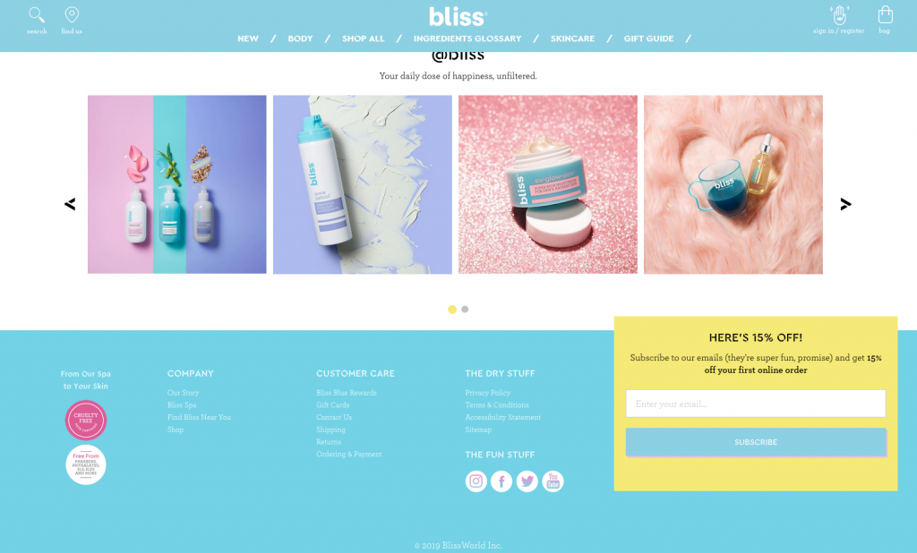
A more concrete example can be found on the Bliss Cosmetics site. At the time this article was written, The text within the footer is very low contrast, utilizing white text over a very light shade of blue.
Putting the background and foreground colors into Color.review indicates that the contrast between text and background is 1.7.
For text, the Web Content Accessibility Guidelines has two criteria, each with two levels of compliance. The general baseline for all text is 4.5 for AA (minimum compliance) and 7 for AAA (Enhanced Compliance).
The second criteria adds additional compliance for large text, which is classified as either 18pt (24px) or 14pt (18.6px) that is bold. AA (minimum compliance) for large text is 3 and AAA (enhanced compliance) is 4.5.
A third, more dubious criteria for text exists as it relates to logotype. WCAG 2.1 does not provide success criteria for text contrast when used in or as a logo. I recommend putting your customers before your brand here. Test the colors of your logos against background colors and hold the logo to the same standards as your content. It could be argued that the ‘Bliss’ Logo in the example above is difficult to read.
Checking for Contrast of Text Over an Image
If you are using a tool such as the AXE Browser Extension or the page audit tools in Chrome to test for contrast issues, you will notice reported contrast issues where the contrast cannot be determined. This happens when text is either floated on top of an image or when an image is used as an interface element.
Testing contrast for text over an image is difficult; in fact, I would flat out say it is impossible to eyeball. You can err on the side of dark, lowly-saturated images with low complexity covered with large print bold text if you are unsure. The best tool in my toolbox is the Brandwood.com – Text on background image a11y check guide. It allows you to overlay text on an image and get a percentage of compliance. You will also get an average color breakdown with individual pass/fail results that give you the information you need to adjust your image if necessary.
Checking for Contrast of an Interface Element
Interface elements, such as icons or controls, have different rules when it comes to contrast. The minimum requirement for interface elements is 3, much lower than text, and only has AA compliance. Automated accessibility checkers have trouble detecting contrast for interface elements, generally because they do not have an intrinsic color value set through browser styles.
In these cases, you will need to manually compare the color of the interface element against the backgrounds it will sit on. This is another case where a tool like Color.review is excellent.
Why Are We Using Poorly Contrasting Colors?
You can read it, and it looks good to you, right? This is why we make this mistake. We do not check the raw contrast number against our instincts. You have to do this to know your color contrast is where it needs to be.
Color contrast is a difficult problem for those of us working with clients that have long-established brand identities. If you are not in full control of the colors, use something like WCAG and Color.review to illustrate to your client that the accessibility need of the content is more important than strict brand adherence for something like a footer.
Improper Image Markup
Missing ALT text for images has been an issue not just for accessibility, but for SEO for some time now. Many reading this article may be familiar with the concept, but here’s a quick recap just in case.
The ALT attribute on the <IMG> tag in HTML allows for a description of what the image is depicting to be embedded in the image. For Google, this can mean getting your images indexed properly in Google Images. For users with visual impairments, this allows the visual content of an image can be described to them.
Decorative Images Versus Instructive Images
Let’s take this a bit further. Not every image needs ALT text. “Madness!” you exclaim, but it is true; not every image is worth a description. From now on, when you look at an image on a page, ask yourself, “Would THIS page/list/article, etc. make the same amount of sense without this image?” If the answer is yes, then that image is likely decorative. Only images that supply contextually relevant information that cannot be extracted from the text need ALT text. For instance:
- Icons next to text in a menu? Decorative.
- Using an image that makes a purely visual comment or pun? Decorative.
- Image used as a background element? Decorative.
Marking images as decorative is simple. The ALT attribute needs to be on the <IMG> but left blank. Most screen readers will skip over an image with a blank ALT attribute.
Improperly Labeled Form Fields
I am going to come out swinging on this one…
“Forms need to be ready to wear for users and not Haute Couture for a brand.”
– Jeremiah Bratton, This Article
With that out of the way, we can talk about the issue at hand. All input fields on a form need to have a visible/discernible label. It is still common to see forms that are missing or hiding labels and attempting to replace them with placeholders.
The Label Versus the Placeholder
For clarification: a form label is a separate element that is set in close proximity—usually above, sometimes below, or to the side—of an input field. A placeholder is a lightly colored (usually too low contrast) string of text that sits within an input field and is removed when a user begins to type. The role of a form placeholder is to suggest desired information, not a persistent label. Directly, “First Name” is a label and “Steven” is a placeholder.

Labels and Screen Readers
Form labels are important for screen readers because they are announced to users to help orient them as they move through a form. Labels can also be announced out of sequence. For example, if your user is moving up from the bottom of the form to correct a mistake, the label can be announced when the user enters a field BEFORE they would reach the label.
General Best Practices for Form Labels
Whether you are using a screen reader or not, visible, discernible labels provide a clear/concise marker for the information that is expected in a form field. As I stated before, placeholder text disappears when a field receives any input, essentially un-labeling it. Think of a distracted user halfway through an address field that no longer has a label. They may return to the form after a shift in focus, and now they have to regain their footing purely through context instead of direct information.
Or, consider an elderly user with a cognitive impairment (such as MCI) that may make fluid streams of thought challenging to maintain. That label is a firm, persistent reminder of the expectation, and is the difference between accessing your services or going somewhere else.
Why Are We Missing Labels?
Labels have a reputation for being bulky, redundant, and hard to account for in design. In many cases, lead forms, newsletter signups, and even filter controls end up in small places. In the interest of maximizing real estate for a form, the humble label is the first one to get cut. But from the perspective of a developer, there is no functional reason a form label would ever be removed. Basically, inappropriately labeled forms are a problem created in planning/design and can be caught early before a single line of code is ever written.
Links: Generic, Redundant, or Semantically Incorrect
Links are an extremely large part of the web. With aplomb or abandon, as site maintainers, we sprinkle those things everywhere on our pages. However, links are also as easy to misuse as they are to add. Links need to be descriptive and purposeful and used correctly to steward users of all abilities through content and experiences.
Generic Links
Read More, Read This, Read, More, Go… From here on out, I want you to look at a blog archive or any section of a site that lists multiple excerpts for site destinations and notice how many times the same word or short phrase is used to convey the action a user could take.
The “Read More” button is a holdover from an early internet, a place where websites were not built with interface patterns in mind. Links needed to have eye-catching styles and hard directives on what they would do. To get people clicking, we had to show them there was more to the story and so we began to stuff our sites with links and buttons that say the same thing repeatedly.
When link text is reused on links with different locations, it loses the original intent. Your users cannot be confident where they will land and may be inspired to take no action at all. Your links are no longer functional; they are just noise.
Redundant Links
Another bad use of links, and one you likely will not find with automated testing, is redundant links. Typically redundant links are added in blog rolls or visual article navigations where an image accompanies a title and perhaps an excerpt of text. We desperately want users to get to our content, so we paint the widest target on areas of action. A general practice, one I have been quite guilty of before, is to link EVERYTHING. The title, the article thumbnail, the paragraph, and even still we will add a read more link.
The image below is a screenshot of The Washington Post’s front page. In the rotor, we see a list of all the links on the page in the order they appear in the document. You can see that each article under the ‘Stories from the Lily’ section has two links. One for the title, and one for the image back to back. Similar to decorative images, these additional links are just noise for a user navigating your site with a screen reader.
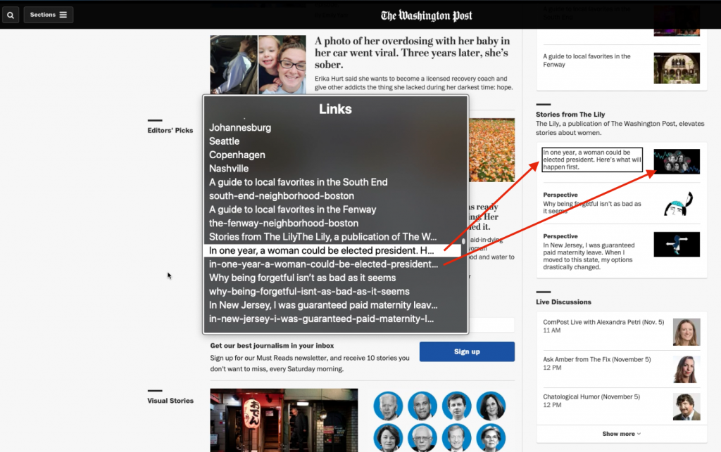
There are better, more efficient ways to tackle this common issue. The easiest fix is to wrap the title and the image in a single link and then mark the image as decorative.
Semantically Incorrect Links
In my experience, the link element has been used as a catch-all for user interaction. The explanation is simple; they have a built-in listener for clicking. A common semantic misuse of links that affect accessibility is when they are used in place of buttons.
A quick aside on the difference between buttons and links:
Buttons: Change the state of a page, or execute an action. They open menus or trigger form submissions.
Links: Change the user’s location. Links navigate. When a user clicks a link, they are taken to another place.
If you look at the screen capture below, you can see that “Sections” is listed as a link (it does not describe its function either).

The distinction here is meaningful because the user is browsing page links. They are looking to GO somewhere. Clicking this “link” will not take them somewhere. It will instead open a menu. This changes the page state, not the user’s location.
If you are wondering about the destination shown in the lower left-hand corner of the example screen capture, using the # symbol as the destination of a link simply scrolls the user back to the top of the page.
Bonus: Use Semantically Appropriate Elements for Interactions
While I was taking screen grabs of The Washington Post, I came across what I would call a bug on their ‘Play Video’ buttons that could be instructive for proper semantic use of buttons and links.
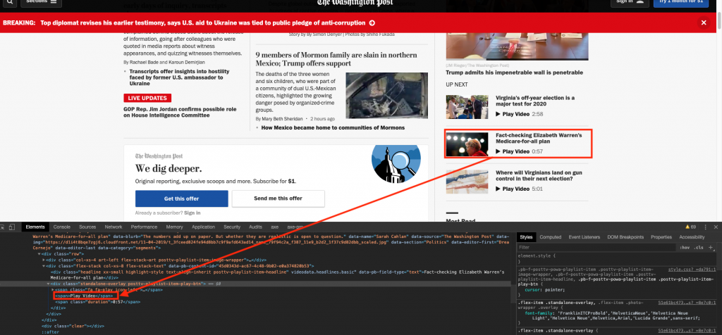
Each “button” in the video section is a generic <DIV> element that is listening for a user click. A <DIV> does not function as a button or a link. This means that all of the “Play Video” buttons are masquerading as buttons but only to a visual user. A screen reader would not list the video buttons when it aggregates links or buttons on a page. Access to these buttons through the keyboard is also not possible.
To be accessible, the interface would require some refactoring. Still, the general solution is to have buttons (because buttons change state, not location) that when clicked swap out the video in the player above the options.
Why Do We Have Bad Links?
Improperly used links fill our sites because we are not mindful of their use. It is not easy for me to point to a place in the process and say, “catch bad links here.” Everyone in the process—from copywriters to developers, to designers—can misuse this particular tool. When you place a link within an interface or content, reflect on how descriptive it is. Does your link relocate the user? Have you used the same text more than once for a different destination?
You Are Now Quick-Started
The issues I have discussed in this article are easy, high-level concerns for accessible applications and websites. The Web Content Accessibility Guidelines alone have 78 criteria to fulfill to reach compliance. Small steps they may be, these are easily implemented fixes that will remove obstacles for the many types of users that come to your business for services or aid. Additionally, with enough exposure, you will see these issues everywhere, and this makes you a positive agent for well-constructed experiences that not only consider a business’s aesthetic ambitions but, more importantly, the people that utilize them.


