
When was the last time you enjoyed filling out a form? No, seriously, like really enjoyed it? I mean kicked in your roommate’s bedroom door to show them a video of a gaze of chunky adorable raccoons tearing at a grown man holding a storage container full of hotdogs kinda fun. Never?
Not surprising. Because, the role of a form isn’t to be fun. A form is a tool that collects data from a user, usually in exchange for services or additional information. A form needs to be efficient, elegant, and accessible.
Forms that meet the criteria I just laid out are more likely to see submissions (conversions). That’s because these forms will clearly request information, which limits confusion, which in turn means your users will more often than not fill in the form correctly and submit it on their first try.
Forms are a big topic where accessibility, user experience, and CRO are concerned. And while there are varying opinions on how to approach forms from each perspective, there is one tactic that is a simple starting point to an elegant, accessible form that all disciplines can agree on: proper form field labeling. When done right, label elements expand the interact-able range of your fields. When a user clicks or focuses on a label, that part of your form will gain focus. No wasted space; the labels actively assist in form completion.
However, when done incorrectly, form label elements can actually detract from the user experience, impact accessibility, and ultimately lead to decreased conversions.
Common Form Label Problems
In my experience the most common issue I find when auditing forms for accessibility is poor labeling. Labels are often hidden and “replaced” with some other aspect of a field. Here are a few examples of those replacements. Let us see how many you are guilty of…
- Hiding or excluding a label and “replacing” it with the placeholder attribute on an input field.


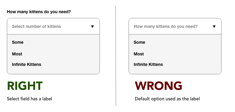
- Adding a valueless option as the first choice in a select field as a way to describe the field’s purpose instead of displaying a label. Example “What country do you live in?” or “Current level of existential dread?”

- Not labeling a group of checkboxes/radio buttons, but attempting to convey the overall meaning of the group through the individual choices.


These solutions usually meet aesthetic wants or satisfy internal requests, but none are correct. There is no substitute for a field label. They are a requirement and need to be kept visible and consistent. Should you find yourself in a disagreement about displaying labels vs. not displaying them, the person on the display side of the argument is correct.
Anatomy of the Label Element
To start off, I will clarify what the label element is and how it’s used in practice.
A label is a textual element in HTML that links to a field to supply more context. The most general usage of a label serves as the title of a field, such as “first name” or “zip code.” Label usage also extends to error messages for specific fields as a way to link errors to a field so that assistive technology can easily access the error message language.
A label element is opened and closed with the <label> and </label> tag. General attributes like “ID” and “class” can be applied but labels specifically support the”‘for” attribute, which is used to link the label to a specific field. The value of the “for” attribute is the ID of the field the label is tied to. Here is all the markup it takes to do it right:
<label for=“firstNameField”>First Name</label>
<input id="firstNameField" type="text"/>
Correctly Implementing Labels in Your Forms
For some, merely discussing the issues in the previous section could be enough to correct them. For everyone still here, this section is where I will dive into how to properly label an online form.
Keep Labels Visible and Consistently Placed
Easy. Don’t hide labels and keep them in the same place. It really is that simple. The label can go above, below, or to the left side of the field; there are plenty of options to design around.
Do Not Use the Placeholder Attribute as a Label
As I mentioned in the common problems section, the placeholder attribute of a field is not a replacement for a label. Placeholders disappear when a field is changed and generally have lower visibility.
Avoid Floating Labels
I also do not recommend using floating labels. This is a design pattern where the label of the field is present, but lays over the input until the user clicks or focuses into it. The label then moves out of the way—or worse—fades out. Often, this little touch of flair causes the label’s text to shrink, and the user may not properly track the animation or change in visual state. This introduces possible points of friction and really isn’t worth the perceived oomph.
Avoid Generic Labeling
Before I go into detail about repeated labels I would like to touch on generic ones. The label attached to a field should clearly communicate the information needed to successfully complete the form. A field that requires a user’s full name is a good example of how a strong descriptive label can convey the request.
A generic label in a form will not get flagged as a WCAG failure, it is not a requirement but… I consider generic labels to be an accessibility concern because unclear communication can make access to content and services difficult. Lack of clarity creates friction, and friction repels users.
To provide an example of a generic label let’s examine a field that expects a user to supply their full name that is only labeled “name.” Name what? Name is generic and leaves a lot of room for interpretation. More context should be supplied to narrow down possibilities and instruct the user to complete the field successfully.
A better label would be “Full Name.” This can be taken further considering the purpose of the information; “Legal Name,” “Your Name,“ “First and Last Name,” or “Preferred Name” are better, more descriptive examples of a label that requests a name from a user.
I have an anecdote about generic field labeling to share. It revolves around a form that collected information for a home moving quote. An important field on the form collected the expected date of the move and was labeled, simply, “Move Date.” This crucial field was causing users to bounce from the form before submitting it.
The solution to the problem you ask? Changing the label to “Estimated Moving Date.” One small change to the label increased the completions of the form. The added context of the word “estimated” conveyed to the user that they can ask for a quote without being 100% certain of their moving date.
Avoid Repeating Labels
Something worth noting is that because a label references the ID of a field, one field could have multiple labels that reference it but a single label can only reference one field. In most cases that shouldn’t be a problem, but this is the internet which means one size doesn’t fit all.
For example, imagine a form that asks the user to list four favorite foods. It would be redundant to have four fields that each have a generic label of “favorite food,” or even more specific labels of “favorite food 1,” “favorite food 2,” and so on. If your form allowed the user to add infinite favorite foods, this would get ridiculous.
Should you find yourself in a place where you need one label to apply to multiple fields, there is a way to do that using the “aria-labelledby” attribute.
Using Aria-labelledby for Multiple Fields With the Same Label
If you are unfamiliar with ARIA I want to quickly touch on two things. First, it stands for Accessible Rich Internet Applications and is an additional set of markup in HTML specifically for assistive technology. Second, is a warning that ARIA has to be used correctly or it can really mess up the experience for an assistive technology user. If you don’t need to use it, then it’s best you don’t.
But now back to my example. You gotta have those “favorite food” labels! aria-labelledby is placed on the input element, and references the ID of the label that applies to the field. aria-labelledby can also tie multiple labels to a single field by putting a space between each ID.
Here is an example of aria-labelledby being applied to four text fields that all use the same label:
<label id="favFoodLabel">Favorite Foods</label>
<input type="text" aria-labelledby="favFoodLabel"/>
<input type="text" aria-labelledby="favFoodLabel"/>
<input type="text" aria-labelledby="favFoodLabel"/>
<input type="text" aria-labelledby="favFoodLabel"/>
That’s It!
Ensuring labels are present and properly linked to fields, keeping them visible, and making sure they are clear and descriptive are some easy steps to creating good forms that allow the most amount of people to interact with them. And while I understand that Minimalism is a tempting (and popular) design philosophy, the forms you put out in the world can be aesthetically pleasing, but that goal should be secondary to functionality. You, the person reading this, likely fill out forms all the time. Search your experiences and think of how many times you needed a form to be useful and respect your time rather than fun to look at.
We also put a really nice form on this page that properly instructs you to supply your email address in return for blog updates. You should try it, for educational purposes… of course.


