
There are things you don’t know about your customers. It’s not you, it’s them. But you need to figure it out. Here are some hard lessons I’ve learned over the years – they apply to usability, pet peeves and other fun stuff. Learn these and you’ll have more, happier customers/visitors/readers/fans:
1. Reading onscreen is hard, for everyone
The most basic principle of usability: It’s hard for folks to read online. Much harder than reading in print. Remember this. Burn it into your brain. Small typefaces, weird page layouts and odd color schemes may seem great, but they’re bound to hurt your business in the long run.
2. They like short paragraphs.
Oldest rule of marketing, from way back when we printed on paper and used mail and stuff: Write no more than 4-5 lines in a paragraph. Read My Life in Advertising and Scientific Advertising (Advertising Age Classics Library) to learn just how little the rules have changed.
3. They like short lines
Reading onscreen is hard. The typical person can best read 10-20 words per line. No more. If you’re using microscopic fonts to fit every word possible on a line, change your ways.
4. They like wide line spacing and nice margins
Also know as ‘leading’, wide line spacing makes text easier to read. Margins shorten the lines so that you get fewer words per line (see above).
Folks actually read faster when line spacing is really tight, but they retain and comprehend less. A fantastic piece of research by the University of Wichita proves it.
5. They like dark text on a light background
We are trained to read dark text on a light background. It’s what we’re used to. So this:
The quick brown fox sprayed the lazy dog with mace.
Is easier to read than this:
The quick brown fox sprayed the lazy dog with mace.
The dark background really jumps out at you, but make it into a whole page and it starts to give you a headache.
Do you hate your audience? No? Then go with dark text on a light background.
6. They don’t mind scrolling up-and-down
With those nifty mouse wheels, folks stopped getting unhappy about scrolling – it’s no longer a usability issue, unless you create a 5000 word page or some silliness. You don’t have to make a home page, or any other page of your web site, fit in a single window. Long pages are OK!
7. Lists make their lives easier
You can write a list in a paragraph, so that colors look like red, green, blue.
Or, you can write a list in a list, so that colors look like:
- Red;
- Green;
- Blue.
Your audience wants the latter.
8. They browse in an F-shape
Read Jacob Nielsen’s excellent article about the f-shape browsing pattern: Click here.
Put the most important stuff in the critical points of that F-shape, and you’ll get better results.
9. They can’t remember your web address
Seriously. No one ever remembers a web address. Oh, sure, if you’re ‘nike.com’ or ‘cnn.com’, they do. But if you’re ‘portentinteractive.com’ or ‘conversationmarketing.com’, good luck with that.
Give people plenty of ways to subscribe, bookmark or otherwise remember you. And reserve different permutations on your web address, to protect your brand.
10. They don’t want to log in
Don’t make them log in to check out. Let ’em just click ‘check out’. By all means, give them the option to save their information and create an account. At the end of the checkout process. At that point, the warm fuzzy feeling any consumer gets from burning hard-earned cash is enough to get them to trust you.
11. They don’t even want to think they have to log in
I know what you’re thinking: “Oh, fine, I’ll just put a login form on the left, and then put a tiny little button on the right that says you can check in as a guest.”
No. This:
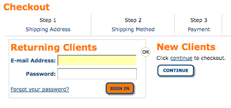
Tells me, the customer, “You are not part of our exclusive club. Click ‘continue’ and buy, but you are a loser.”
In all seriousness, customers don’t trust the internet. Never mind that they’re 10x more likely to get their credit card stolen in a restaurant. They see the web as a massive interconnected den of thieves. If you even imply you’re going to save their information, their trust is lost. Don’t do it.
12. They don’t even want a tiny hint or implication that at some point in the future they might have to log in
Just let them check out. For the love of all that’s holy and good in the universe. Can we just drop it?
13. They don’t want an ‘experience’
In the immortal words of Jakob Nielsen: “Most people just want to get in, get it and get out.”
Adding dynamic “web 2.0 stuff” (shudder) just because the other guy has it is foolish. Anything that makes me click twice instead of once is going to impress me the first time, and then alienate me after that. Examples include:
- Drag-and-drop shopping carts. Clicking is easier.
- Home page preloads. Clicking ‘skip intro’ is still extra work.
- Fly-in, fly-out or slow fade-in, fade-out effects for product zoom images and such. Every time you do that, you make the customer wait. Why?
Customers and visitors don’t want an experience. They want service. Only designers and geeks like me equate a great product/service with clever use of javascript libraries. The other 99% of the population wants to get in, get it, and get out.
Don’t take my word for it. Look at the web site of one of the ultimate design companies: Apple.com. See any special effects?
14. They do want your newsletter
Hard to believe after all the spam hysteria, but a sizable chunk of your audience still wants to receive a newsletter. So make it easy for them to find it.
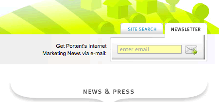
I was one of the worst offenders in this department. On our corporate site, we had a little e-mail icon, buried 1/3 of the way down the page, for our newsletter signup.
We made a very simple change, adding a signup form on every page next to the icon, and we’ve seen a lift in signups just a week later:
15. They don’t care how clever you are
If you can say “Ian Lurie arrested in drunken rampage”, just say it. Don’t say “Pugnacious Portent Prez Pegged by Police”. The former tells me what’s going on. The latter is funny but unhelpful.
16. They aren’t enticed by mystery
Your online audience is enticed by clarity, a cool product, a great story and such. They’re not enticed by the mystery of it all.
So a headline like “Great abs!” isn’t as helpful as “10 exercises to get great abs”. And “All Wired Up” is utterly worthless compared to “Wired Magazine Has A Great Year”.
17. They get lost a lot
It’s easy for a site visitor to get lost. A broken link here, a missing button there, and wham, they’re frustrated and confused.
Have a user-friendly 404 error page, a good onsite search tool and really clear navigation. Then review the onsite search data and the 404 errors, and see what they tell you about what your customers want but aren’t getting.
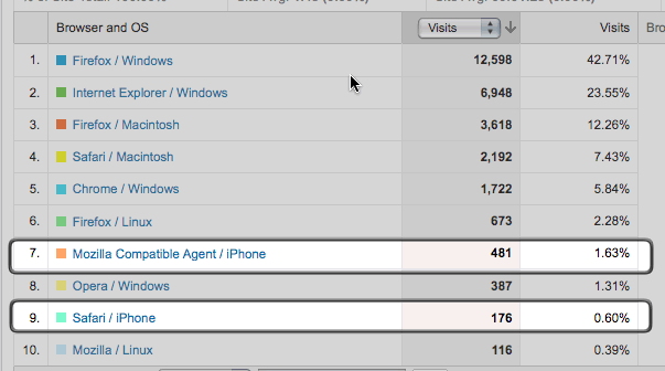
18. They aren’t using cell phones. Yet.
If you do business in North America, chances are your customers aren’t browsing your site using a cell phone. Even this blog, which has more than its share of geek visitors, gets few mobile views:
Plan for mobile, by all means. Learn how to create a mobile style sheet. But don’t derail an entire project, or increase the cost 100%, just to be mobile-compatible.
19. They don’t search for your name
Your audience doesn’t know who you are. They aren’t searching for your name. They’re searching based on a question, and they’ll find you if you can pose the right answer. So, while ranking #1 for your company name is great, it probably won’t help your bottom line.
20. They still use Internet Explorer
Not everyone understands that Firefox is the Risen Savior just yet. Most of your audience is probably using Internet Explorer:
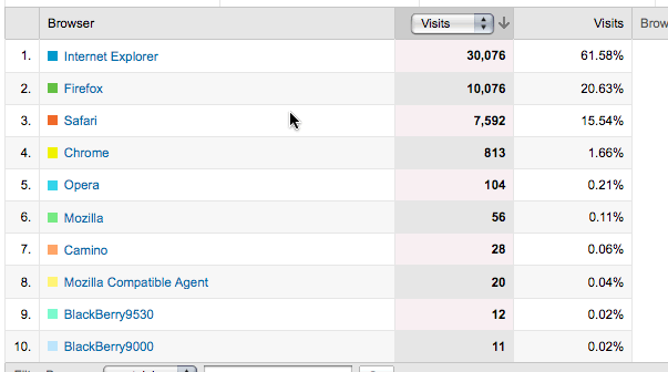
And a lot of them are still using (choke) Internet Explorer 6:
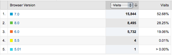
Design, develop and plan accordingly.
21. They’re buying nice monitors (and computers)
On the other hand, most of your audience is upgrading their computer’s graphics capabilities. You can safely design a page that’s 900 pixels wide:
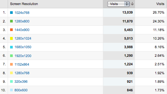
Be sure to check your own site stats before you make a change.
22. They need to want
People buy what they want, not what they need. We all need car insurance. We all want iPhones or other shiny things.
I don’t know about you, but I don’t get the same happy feeling in the pit of my stomach when I consider my next car insurance payment as when I contemplate a new HTC Hero.
We can bemoan this, or go with it. Customers need to want. A truly great marketer explains why they want what they need.
I am borrowing the needs and wants principle from some brilliant marketer whose name I cannot find or recall. I’m not smart enough to come up with it on my own.
Here’s the thing…
This list always gets longer. Look at your analytics report. Learn from the way your audience responds to what you change on your site. Use your brain, and never stop questioning why things are happening the way they’re happening.
And feel free to add to this list, below.
Other stuff to do
- Follow me on Twitter
- Don’t forget to chose content KPIs.
- Work on your marketing copywriting.
- Compare Social Media Attribution Window Platforms.


23. To make your site stand out it’s sometimes worth breaking a few rules (if you’re exactly the same as everyone else don’t expect to be noticed).
I think increasingly approprite levels of interactivity and community are important. Not for the sake of it but to add relevant information or context (through messageboards for example or product reviews) or easy ways to get questions answered (like text based chat or call me back functions).
Great blog. Thanks. Justin (www.basini.com)
Such a useful post, a really comprehensive list of points to bear in mind. Too many companies forget to cater for their customers’ needs with regard to issues such as web browser in use, means of accessing the net and what people actually search for. Hopefully this will encourage people to think more deeply about the issues not directly related to themselves and their products and sales.
Great post and support. Especially liked the point about the email subscribe change.
Excellent article. Good point about the mouse wheels making scrolling no longer an issue…but not sure you have me convinced. I think even if scrolling is made really, really easy, it is still a good idea to make sure to give people reason to scroll down via concise headers, clarity of content and quality of content.
You dared to mention IE 6? I hereby smite you.
Seriously though, needed wake-up call on that one. Anyone who fancies herself a solid CSS/XHTML coder probably has another 1-2 hours in that next dev project if she wants IE 6 to render properly.
Oh the fun of hacking around IE 6…
@miketek IE 6 is a blight. Like many blights, we have to learn to live with it. Blech.
Fantastic post. I’ve been reading this blog for a year and this is the best post so far. Thanks and please keep up the good work.
Hi Ian,
Since first reading this post I’ve been wondering about the importance of highlighting your product/service. In my case, my site is my blog and doesn’t have a prominent call to action anywhere.
Sure, my site has links to my service pages in it’s main navigation, but do people actually take notice without being dragged, kicking and screaming, onto a sales page?
->Apple.com. See any special effects?
Yes. of course! 🙂
it’s an absolutly great Site, but of course full of AJAX-Features: Live Search (wich doesn’t work in all categories). Accordeon Navigators (Downloads). Trailer-Browser with Quicksearch. and so on. I think that’s ok and cool stuff which enables a good “User Experience”. As UX-Pros we have to think about “Most people just want to get in, get it and get out.” in case “who” wants “what”. If you mean “Users don’t really care about your eye-candy-stuff if they have a need” i totally agree 🙂
I have hear that IE is thinking about an upgrading campain towards IE8 for everybody. May be we will get rid of IE6 !
23. They want you to have some sort of personality. No more corporate speak. They want to hear some swearing (god forbid), they want to hear some jokes, they want to hear your voice. So just loosen up and put into writing what you where about to say
Excellent post, I am going to distribute it to my team.
We many times get so over whelmed with the features, facilities, design that we forget simplicity.
Thank you for sharing.
This is a very good and informative article. I also find the items you listed so easy to understand because you are applying them on this post. I’ll definitely be bookmarking this post so I can apply these ideas on my blogs. Thanks so much for sharing this.
this post is very enlightening…it represents customers, telling what they really think
Thank you! This is GREAT. I’m just now getting a blog going and this is truly good stuff.
First time I’ve ever seen your website/blog…now where is that “subscribe” button? 🙂
John
Dave – Have you ever looked into CrazyEgg or ClickTale to see how your customers are behaving? I use both and they are extremely helpful. 🙂
Matt
One Take Media
People don’t want choice, they want exactly what *they* want. Make sure your adwords / landing pages are consistent. Really get in their heads and give them what they want without distractions.
Loved reading this article. Good and valid points. Thanks.
Interestingly, as someone who spends most of his days in front of a computer and has done a fair amount of web app design over the past two years, I have to disagree with a few of these. Or at least, offer some caveats.
#5 is one of the ones I disagree with. It’s been shown that lighter text on a darker background is easier on the eyes (in terms of eyestrain). There’s a reason that I have all my code editors and terminals set up with a dark gray background and white text: if I have to stare at a screen for 10 hours a day, I’d rather not be staring at the equivalent of a 40-watt lightbulb, or by hour seven I have a headache. If you’re going to go the light-on-dark route, however, it’s important to note to NOT use a pure black background. You can’t just invert your usual color scheme and assume that that will work. Font choice and size need to be re-tweaked for a light-on-dark situation to make it legible again, because most fonts were designed for dark-on-light. So, I encourage you to try a dark gray background and white text. Try it for a while and I think you’ll like it. (Note: I also notice that this site itself uses such a scheme in the top navigation bar (white on red), sidebars (white on gray) and the three boxes below (white on gray) so clearly, someone’s on to something here.)
The other one I wanted to mention was #20, especially as it related to IE6. Many people will disagree with me on this, but I think that as web designers and web programmers we have an ethical obligation to help provide the incentive for people to move away from IE6. It may still make up 12% of the total browsing demographic, but part of the reason it has been allowed to hang on like a remora for this many years is because developers keep putting up with it. If we start saying, “no, IE6 is crap and we aren’t going to support it,” then IE6 will disappear from the landscape that much sooner. Imagine you’re an IE6 user and you went to Amazon.com and a little box popped up that says “We’re sorry, but some of Amazon’s features (including wish lists, something else, and blah-de-blah) do not work with Internet Explorer 6. Please upgrade to IE8 [here] or try Firefox [here].” Now imagine that that starts happening on, say, 20% of the sites they visit. You can bet that migration will happen much faster than it currently is. Before you say that such a ‘feature’ is corporate suicide, consider this: I write the online registration site for a fan convention of about 15,000 people. The site gets about 26.5 million hits/month when the convention is running. We blocked IE6 from our application and do you know how many complaints we got from customers? Eleven. Total. Eleven out of 15,000 people were troubled by this, less than a tenth of a percent. The rest went and (ostensibly) upgraded, or at least used someone else’s computer, but we saved ourselves a metric ass-ton of work by making that call. The more developers that refuse to put up with non-standards-compliant client software, the faster that software will die a well-deserved death.
They don’t want to click, they want to scroll.
Do not post one article in 3-8 pages, many people wont bother with clicking through your article at all. I will simply go back to my search rather than trying to find my information amongst 8 pages surrounded by ads and other links and tons of junk around the article.
almost every screen you use to illustrate your points are perfect examples of what you warn people not to do in item 1. of your blog…
This is a great article. These are a lot of things that I needed to hear. Thanks!
You didn’t mention ads. Don’t force your users to view your advertisements. Especially pop-ups. Seems like every site now a-days has some form of advertising. When I start getting ads popping up, I leave the site.
I also hate to be driven to a site via a search only to find they don’t even have the item I’m searching for. If the item I am searching for doesn’t present itself once I’m driven to a site, I leave.
Thanks Ian. That was a great list. Probably you could make it 50 and still it would be a great list, for we all tend to overlook things and reminders are valuable.
Its always Test, Test, Learn, Learn and improvise, in an unending loop.
Analytics, heatmaps … tools become insufficient, when we seriously get into the business.
As Mike put in the #23, we may successfully break the rules, if we really know what we are doing.
Thanks again.
Very good article. I agree with practically anything, just have to check my own designs if they meet the standards described here.
About point 13, I have to disagree a little, with web 2.0-functionalities like Ajax, Javascript animation I find that usability has improved. For example shopping carts that dynamically update the page if you add items, or facebook that slides out extra content when asked for, “featured”-sliders on various news-sites etc..
I’m gonna print this list and use it everytime I finish a design to test against.
Greetz,
Tom.
“They need to want”. I think you broke your own rule 16.
Ah Ian, you put very succinctly into words what we have been telling our punters for a while.
Thank you so very much for this fabulous piece.
If I may add a little piece of advice; change the syntax occasionally. Make a few “minor” grammatical errors. The reason being the mind doesn’t react to the usual! It will skip most of the message unless its written slightly differently.And while searching for more “minor” errors will in fact digest your message. Trust me it works. Just make sure you know the rules before you break them.
Most of the rules are only “forbidding” things that weak writers use as crutches to try and pass off their written word as real prose. Sure, there are plenty of great writers who break those rules, but there’s a reason we call them great, and it has nothing to do with rules. There’s a reason we call bad writers bad, too, and it also has nothing to do with rules.
Cheers and thanks once again.
Good stuff, Ian. A lot of what you say can and should be used with any type of direct response marketing. Especially 15 and 16. Shame on all those creative types wanting to flex their muscles, amuse themselves and impress their peers at the expense of their clients.
Maybe light text on dark background works for Andy’s coders. If you have something to sell, sell it with black text on a white background.
This is an excellent list!! It is also a good idea to use things like CrazyEgg.com ClickTale.com Pagealizer.com and AttentionWizard.com to figure out where they “get lost a lot.”
On “They don’t want an experience,” A+ to you! Haha, I’m using the “StumbleUpon” addon to browse through sites, and right after I read this post I hit stumble and went to a page that had a different tone connected to every links mouseover. I played with it for 20 minutes and STILL have absolutely NO idea what the page had to do with.
Excellent list of well written points, however I think there does come a time when you need to stop constantly questioning every little thing and be contempt with your achievements. Great article, this will help update my methodology.
@Alan I think you mean ‘content’ 🙂
There have to be some folks who are never content with their achievements. If there weren’t, we wouldn’t have much progress in the world, right?
Ok but whats the point of their ability to save account information at the end of checkout if they absolutely positively should never be able to log in in the first place?
Personally, I’m glad I can log into Amazon instead of filling out that cart every single time.
fantastic post? really everyone? these aren’t thing you couldn’t ascertain yourselves?
“5. They like dark text on a light background.”
My gods, there’s nothing more I detest than having to stare at a glaring white screen on my laptop’s LCD. When I read a book, yeah, I’m used to blank print on a white page, but I don’t aim my desk lamp directly into my eyes.
“If we start saying, “no, IE6 is crap and we aren’t going to support it,” then IE6 will disappear from the landscape that much sooner.”
The major corps I’ve worked with (some publicly listed) only support back 2 versions. I would say that’s reasonable… but I didn’t neccessarily agree because, Andy, some people can’t upgrade for many reasons or don’t want to. I agree with your sentiment I disagree with the tactics.
“Total. Eleven out of 15,000 people were troubled by this, less than a tenth of a percent. The rest went and (ostensibly) upgraded, or at least used someone else’s computer, but we saved ourselves a metric ass-ton of work by making that call.”
Said like an eltist web designer who knows shit about marketing!! Just maybe there were a few thousand who were just tooooooo pissed off to bother even writing or attending or complaining because they thought **you don’t care**! I tell clients who want M$ PPC to go elsewhere because the M$ PPC platforms never work right or expect you to use this specific browser at this specific time or some other nonsense that I just say… go F*CK yourselves if you want my business then give me a useable site!
As to the dumbasses who expect you to download useless F’in quicktime plugins to play a video clip… well there’s a site called YouTube you might want to consider adding that as another alternative to a piece of crap plugin that only the gayest Mac users and UNIX admins really bother to download! There’s a reason it’s not a bundled browser plugin and never will be!
Was that too much cursing? They say I’m quite well versed in that area! 😉
I’m a consumer and frequent internet user. I see a lot of sites. I see a massive number of bad sites and a few good ones. Permit me please to add my two cents.
BE CLEAR. BE SIMPLE. BE ORGANIZED.
When I view a site it’s by one of three causes:
-1) I am looking for a thing or information or a service that I’ve identified in my own head. My task is then to figure out if you have it.
-2) I surfed randomly and I’m not looking for anything particular. (I love StumbleUpon)
-3) I use the services the site offers, such as youtube or sendspace and I already know why I’m there and what I’m planning to do.
These 3 causes give rise to 3 different page features that I find very important.
1) I know what I want.
-1a) I need a search bar that searches your site. The search should provide an option to search troubleshooting info if applicable, and an option to search product/service information. If there are multiple names given to something, you need to treat these equally. e.g. tea cup and coffee mug are similar enough to warrant inclusion but the results need to be separated. If you sell coffee mugs and I search for tea cup, don’t tell me there are no results for tea cup without saying “Hey, coffee mugs! We gots!”. Bottom line on the search: it’s used if I know what I want and I’m trying to get in, find out if you have it, get it, and get out, or if your site is confusing and complicated. Especially if the whole site is barfed up onto your front page.
-1b) If you can’t categorize the content, how do you expect me to find it? You should work in groups of 7 or fewer, and each group can contain another 7 or fewer subgroups that lead a person logically to what they need. I need a simple page with these 7 groups that says “logic and function and efficiency”. The critical counterpart to this is the search bar since I may be looking for something that’s hard for me to categorize.
2) Random page hit.
-2a) This is an opportunity to show me what you are. If what you are is a 747, show me an airplane, not the central flight console. You have to assume that every visitor to your site is a first-time person that got there accidentally. They need to ‘get the point’ in 1-3 seconds. It doesn’t take long to discover I’m in the wrong place, and that’s how much time you have to encourage me to stay and have a quick look.
-2b) Have you ever sat behind a business van or car in traffic and it’s decorated with the business name and phone number? And there’s no hint of what that company actually *does*? Well it happens an awful lot to me and I forget them immediately. Same for the web. If I hit your page and I can’t figure out what you are within a few seconds, then I assume you have nothing to offer me because either your business doesn’t relate to me or you’re too stupid to make it clear. Obviously this can be industry-relevant and isn’t the same for everybody. A company that does systems analysis isn’t going to have the same approach as a company that does eyewear.
3) Frequent flyer.
-3) I’ve been here before. I need to get to the things I use quickly. For those that don’t log in, there should be quick links to the most popular items used by people who visit frequently. For those that log in they should see a useful and slightly more content-rich page since they have more familiarity with the site. That doesn’t mean they want your whole website on their front page. No. Let me repeat for emphasis. NO.
DO
– Make your index page pleasant, clear, and fast. A business name, an industry-type identifier or similarly explicit tagline that puts the function of the site within the context of the identified industry, a graphic or two. A list of 7 categories I can click on, and an additional list of frequently-used links.
– Provide a search bar that functions sensibly.
– Minimal flash because flash=slow. I don’t care how fast my computer is. I bought a fast computer so it would be FAST, not so you could bog it down with pointlessness. I don’t give you the license to take up my valuable time and bandwidth with your moving art unless moving art is what you DO.
– Did I mention minimal flash? No? Are you paying attention?
– OMG stop it with the flash. JUST STOP IT!!!
DON’T
– Don’t clutter the front page. Don’t make me scroll on page 1.
– Don’t use pop-ups, and especially not flash popups that obscure content. I will immediately exit your site.
– Don’t assume your visitor knows what you do.
– Don’t use too many colors and fonts. Everything has to be coherent and cohesive.
– Don’t cram text onto a page. Make it readable, use whitespace to separate things that are logically separate.
All of my commentary comes down to this:
If you offer me everything all at once, it’s like blending a 4 course meal and pouring it down my throat through a large-diameter tube. It would have been better if it had been organized and inviting, and I’d have eaten it happily.
After reading the comments, these gems from the bowels of my brain come oozing forth:
–IE6–
I don’t like IE6 any more than you do, and I’m not even a developer (I’m using Firefox on Ubuntu Linux). But if your website doesn’t work in IE6, then it’d have to be pretty spectacularly useful and important to encourage someone to switch browsers. I’m sure in *some* cases it’s warranted and the customer is really missing out on convenience and function. Chances are it’s just full of nonsense graphics that don’t help enough to warrant their use because the developer knew how to code that way and the executive thought that everybody likes it that way. Twitter.com is a great example of a really crappy site that’s slow for nothing. It could be a wonderful site and it’s not. One simple concept and they screwed that up terribly. I have to use a news reader just to read tweets.
Encouraging a person to upgrade is perfectly reasonable though, because aside from your content, they may not be aware they CAN upgrade their browser to something else. Maybe it’s the solution to problems they couldn’t identify. Maybe they just thought “the internet sucks” and didn’t realize that their browser was so limited.
Most of the people I know are non-technical non-creative people who wouldn’t even know what I mean when I say ‘browser’ until I say “what you use to see the internet” much less know what version. In fact, whenever I’ve asked, the answer is always the same…”I don’t know, whatever comes with Windows”. They click something on their desktop, always.
So on the subject of encouraging people to switch, it’s not likely they should switch because you offer them something grand. From what I’ve seen on the web, the chances that your web 2.0 content is well-applied is low. But they should switch for better security and to reduce frustrations caused by technology mismatch.
It’s worth noting I have no sympathy for anyone who has been using a piece of software for years and feels entitled to indefinite support, even if they use it to buy things. Technology moves on. I don’t use a cassette player anymore.
–Text–
I prefer black text on a light background but not white since it’s more eye-straining. Remember, paper doesn’t glow unless you’re in the sunlight, and that’s eye-straining too. Either that or white text on a dark background but preferably not a perfectly black background. Very dark greys and blues work best for me. I agree with the user that said the white text font and size needs to be different, because the contrast plays games with your brain.
–Login–
I don’t mind being given the opportunity to log in on the first page, that’s sensible. But how you present it is important. For instance, make it clear that the person can log in to retrieve the information they *CHOSE* to save on the last visit, or proceed as a guest with the option to save at the end if they wish. In other words, inform people of their options and what those options mean. Make it clear they’re not required to save their info but they can if they want that convenience. It’s all about setting the right expectation.
–Experience–
Yes, I do want an ‘experience’ on a website. I want to avoid becoming angry.
–Advertising–
I’m ok with ads. They pay bills. But keep your adds in a place that’s not integrated with your content, over on the side and unobtrusive. Frame them attractively without using computer power for it. And don’t allow ads that jump or flash.
*smooches*
Mr. Pooposterous,
Your eloquent prose is delightful.
Just wondering, are you by chance a freelance copywriter that charges per word?
@Nick
Dear Mr. Nick,
Thank you so much for your kind compliment. I’m now happy that I removed the naked supermodel and Jerry Bruckheimer references from my last post because with them I’d have lost the ‘eloquent’ status in a somewhat dramatic fashion.
I’m not a freelance copywriter that charges per word. I’m a barely-employed, verbose tech worker from Canadeh and I’m very, very fortunate that my ISP doesn’t charge me for the words I use because I use an awful lot of them. I believe the technical term is “metric ass-ton”.
I’m pretty passionate about the subject of website design because many sites don’t conform to my specific requirements and this vexes me, not because this is arguably a violation of the Geneva Convention but because the internet should operate according to the optimal function of *my* brain. Everyone else can act like big boys and girls and just deal with that.
I’m sorry that the truth of who I really am is going to be such a crushing disappointment for you. The truth, like the internet, sometimes hurts a lot.
Verbosely yours,
Mike :o)
Spufflers’ observations:
A] I already have a spreadsheet tracking almost 300 ‘logins’ for various websites, forums, blogs, social network sites, corporate sites, and so on. Let me clarify: I really, REALLY will not want to “Join” or “Log In” just to tell a blogger how misguided they are. Some blog posts/bloggers are frequently misguided or stunningly out of context. (But not here, thank you).
B] Point #14: No, I most likely do NOT want the newsletter. Do NOT assume I want a newsletter when I give you my email address; you get my email address because there might be trouble with this order, the presence of an email address is ABSOLUTELY NOT an ‘expressed nor implied permission’ to send faux ‘deal’ newsletters. When I want such a newsletter service, I’ll click the check-box to grant my permission.
C] Your webpage’s “Topics”, “Popular”, and “Blogroll” are all in violation of point #5.
D] Point #17: Umm, I do not elect to become lost, I am stuck with bad weblinks. Suggest providing a webmaster contact in the ‘404’ page. Most of us now understand that ‘1 at 2 dot edu’ refers to the real email address ‘1@2.edu’. Oh, wait, that’s my fake email address for these stupid blogs to have something to harvest, just so I can correct misconceptions per A], above.
E] Point #18: If VerizonWireless has their way, you’ll NEVER see me visiting you via my cellphone. Verizon hates letting users surf in most cellphones…. they jam a bad browser into most cellphones then lock the cellphones into their ‘circa 1998 AOL-like restricted web experience’. If you want me to visit you, get on VZW for copping the attitude of ‘Big Brother’.
#5…
As soon as I was about to leave this page because the black-on-white text was hurting my eyes so much, I read this…
There are very few times that I read black text on a pure white background that my eyes do not strain.
The one thing I’ve noticed, though, is that it’s not necessarily the black text that hurts my eyes, it’s the fact that computer screens are so blindingly bright that a pure white background is like looking at the sun. I have the brightness on all of my monitors turned as far down as possible, but my eyes are still straining as I type this.
However, when I read black text on a light gray background, I don’t feel as though my eyes are straining as much.
@Pooposterous You are my hero.
Re: #13… (Just an observation)
“Look at the web site of one of the PENULTIMATE design companies: Apple.com”
I wouldn’t have noticed this except that I saw a TV show last night (Gary Unmarried) where his Ex was very embarrassed for using that word incorrectly.
Is Apple really the “next to the last” design company?
(She thought it meant The Best!)
Loved the post. Many great points! (…and reader comments!)
Danno
@Danno Yikes. Thanks for pointing that one out. Kinda like having spinach stuck in your teeth all night – if no one tells you you feel a lot worse when you get home.
‘Penultimate’ is now ‘ultimate’.
Great list here, a lot of this seems like it would be obvious but after a second thought I realize I break many of these rules myself. Especially number 13. As a developer I frequently get carried away, writing elaborate scripts that take hours to complete. It took me a long time to accept the fact that my clients don’t care how a web application functions just as long as it does what they want.
Love it. Right on. Kudos!
As for #13 – “They don’t want an ‘experience'” I couldn’t agree more. No one thinks “Hey, I want to see how cool the FedEx site is before I can decide if I’m going to use them to ship my package.”
I’ve always felt that the only appropriate place for the experiential site is a fashion site, or a music site (but you better not get in the way of making a purchase!), and sites specifically developed for graphic designers, because that’s part of the sell (a/k/a the cool factor).
I thought apple was a tech company…
Amen to 13…please get rid of the home page intro…and pretty music running in the background!
@anon Nope.
I loved, loved, loved this article! I immediately put point 7 into practice listing what my customers get in their astrology reports to make it easier to read. Guess I was worried about too much point 6 (scrolling).
On my to-do list is to fix it so people can buy my products without having to set up a login and password – no-one ever uses it, and those that (have to) login to buy something tend to forget their password anyway.
When it is obvious that you are using black text on a dark gray (stripped, even) background, it’s hard to take your advice seriously.
As a technical writer, manager, and document designer for over 30 years, I would never allow that from anyone that worked for me. Yet, you hope someone will follow the advice you cannot follow yourself? ROFLMAO!
Aside from the fact that I have black text on a white background, you’re spot on.
I’d be curious to curious see some evidence for the claims you are making on the following points.
3,6,9,13,14,22(huh)
White text on dark background! YUK..
I have very good eyesight, do not wear glasses at age 69.
BUT – like many older people I CAN NOT,(do not even try any more,) read anything written in white.
SO YEAH, IF YOU ACTUALLY WANT PEOPLE TO READ IT, I’D SAY STICK WITH THE TRIED AND TRUE!
Man, I’d forgotten how great this site was. What a cool article!
My pet peeve (actually heard this from Marketing Director once): “We want to give our customers a *rich* experience.”
Me, sotto voce: “They don’t WANT a freaking *rich* experience. They want an easy, fast, quick, and did I mention fast? experience.”
[insert head-banging emoticon here]
I have to keep this short. Long paragraphs are
not appreciated.
AND
as Always….. whatever vitamins you take? I want some. Your knack to send a message is outstanding.
I have noticed that creative metaphors do tend to make a puzzle more than a smile.
Excellent post. I really need to get around to losing the login!
I also think it should be the law that web designers adhere to “They like dark text on a light background”.
About 30% of people have astigmatism. If you do, there’s a good chance you simple can’t read light text on a dark background for more than a couple of minutes. I simply refuse to stay on any site that does it for its main text.
Very helpful, if only this could be pushed under the noses of certain popular site’s designers.
Brilliant and highly relevant to my industry which is having to embrace internet marketing because that’s where customers are going and not because that’s where my company/industry wants to go.
The greatest obstacle we face is that no one really cares about the end-user’s experience, except that they are an input into a process that generates results. Not surprisingly, our results are pathetic.
Interesting what you said on #14. I wasn’t sure whether to continue or stop our newsletter. But now I know the answer. We will carry on! Thanks for the information, very interesting read indeed.
@Ian:
Does #6 still apply? I just read a report from a company supposedly experts in conversion, and they said the opposite (with very few exceptions)? 🙂
Thanks a lot for the link in #8, didn’t know that one!
I absolutely HATE having to log in constantly. It’s not that your site log in is a problem, it’s that there’s a lot of sites I frequent and yours would be just one more password I will forget.
I’d like a biometric device where I could scan my damn fingerprint in to websites and never log in again EVER! Something like that will come in the future I’m sure.
Great article my friend. Fantastic points that people would be well advised to listen to. I#ll be back for more!
@Pooposterous – laughing my ASS off over your metric ass-ton of words. Such good ones they are!
But on the original post – awesome stuff! Just awesome! I thought I had read it all, seen it all, done it all, and then, I click through your FB ad and actually found something worth reading! That doesn’t happen often!
In particular, the google analytics stuff has given me another compelling way to kill hours of my time each week because all of this stuff in enthralling to me (I am being SERIOUS!). Paying attention to what happens on our appraisal site (via google analytics) has paid off – we get more traffic, but more importantly, people are staying, reading, returning and ORDERING!!!
Thanks again for spreading the word. Now if only the blinky-flash-tiny-text folks would start paying attention!
you’ll probably never read this again, but the marketing strategist you were trying to think of was Edward Bernays. Bernays was actually the nephew of Sigmond Freud and, in fact, played a large part in getting his uncle the the recognition he has today.
#8.
Try reading any written text – and guess what – your eyes track an F-shape. Its the result of having lines of text above each other, and the English language being read from left to right.
You don’t need eye-ball tracking for this piece of “insight”.
Hebrew web-sites will have a reverse F I guess.
Thanks Ian, This is a very good and useful article. I find the items you listed so easy to understand because you are applying them on this post. I’ll definitely be bookmarking this post so I can apply these ideas on my blogs. Thanks so much for sharing this.
Ian, such a solid article man. I’m getting more and more into understanding my userbase and this is honestly one of the best posts on the subject I’ve read in a long while. Concise yet very very informative.
Your talk about the newsletter is so true. I used to think how people would consider it spam but the more users I’ve had sign up for a newsletter, the more I’ve been proven wrong. Good stuff!
Interesting Post Ian! A great list of important factors to keep in mind for the usability and effectiveness of your online business presence.I agree that the easier you make it for your customer to use your site and receive your message the more successful you will be in your marketing.
And as you said at the end find out what your market responds to by testing different things, measure results, test some more,measure results and test some more.I think you got the point. Also look what is working on other successful sites and model there approach for faster results.
Got to disagree with rule 5 (They like dark text on a light background) if your website is heavy on reading material. Looking at a computer screen is somewhat like staring at a light bulb and using a light color background will only further strain your eyes over time. A dark background in the case would absolutely be preferable. Maddox’s website is proof of this, and he gets plenty of page views.
I’m not a freelance copywriter that charges per word. I’m a barely-employed, verbose tech worker from Canadeh and I’m very, very fortunate that my ISP doesn’t charge me for the words I use because I use an awful lot of them. I believe the technical term is “metric ass-ton”.
Is #18 still applicable?
Very nice list. As someone who spends a lot of time “hearding” customers to our site I find blogs like this absolutely priceless. #4 was something I’ve been preaching for years!
I think a lot of these are so much design based observations and lessons learnt. Some are very obvious yet completely ignored and some are “oh really” :).
You can learn a lot by using some kind of web-analytics tool. Though every person is unique, you can surely draw some generalized conclusions once you have data.
Thanks Ian, very informative.
Well, that was just freakin’ useful and to the point, wasnt it? Nice work.
I see the post was written in 2009 but man, does it still apply in 2011 (almost 2012 🙂
Happy new year 🙂