
My mom’s a PHD physicist. My dad, a PHD engineer. By the time I was 13 they’d both given up on any dreams of me being a math genius and instead hoped I’d finally count to 20 without removing my shoes.
So, when I click ‘publish’ for this post, I’m going to flinch a little, waiting for someone who’s actually math-competent to call me out as the fraud that I am. But I’m writing this anyway, partly because this is analytics 101. If you work in marketing, you need to know it.
What’s a Rolling Average?
A simple rolling average (also called a moving average, if you wanted to know) is the unweighted mean of the last n values.
My first reaction when I read a definition like that was, “Buh?”. Maybe it made sense to you, but to me it’s total mathinese.
Here’s my definition of a simple rolling average: An average of the last n values in a data set, applied row-by-row, so that you get a series of averages.
Buh?
OK, try this example. The column on the right is the rolling average:
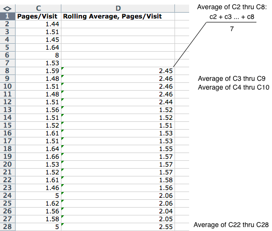
See how that works? I’m just taking the average of the last 7 rows, all the way down the column. That’s a simple rolling average.
And trust me, I stop at ‘simple’. If you want to learn more complex rolling averages, read the Wikipedia page.
Why Use a Rolling Average?
A rolling average can help you find trends that would otherwise be hard to detect. Using the data from above, you get a graph that looks like this:
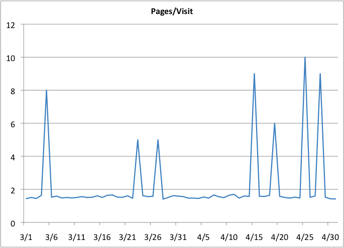
That’s not terribly helpful as a trend detector. It looks like my website got a case of the hiccups.
Use a rolling average, though, and you start to see a pattern emerge, with peaks happening more and more often:
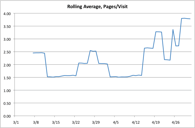
That’s why rolling averages are so useful: Apply them at the right time and you can get an idea of emerging trends, even if those trends are happening because of sudden jumps in your data.
I’ll stop there. Math-competent folk, feel free to leave endless comments about how I just mangled your favorite concept…


Quite simply the most useful blog post I have read in a very long time. I suspect that most of us in marketing are math morons; I personally am a failed engineer! But your explanation of the rolling average and what it can do to help identify trends is excellent–very useful information. Thanks for taking the time to share it!
An absolutely brilliant post! Rolling averages help us track and analyze progression levels for just about any given metric. It gives a more realistic picture than the standard average, enabling us to take corrective action as and when needed. Rolling averages are especially useful in forecasting revenue. Sorry, i can be a math moron myself.
An absolutely brilliant post! Rolling averages help us track and analyze progression levels for just about any given metric. It gives a more realistic picture than the standard average, enabling us to take corrective action as and when needed. Rolling averages are especially useful in forecasting revenue. Sorry, i can be a math moron myself.
I never comment in blogs so bear with me if I say anything out of the ordinary or have a crappy structure.
I would like to thank you for the information in this blog, being new to many of the marketing concepts presented the easy to understand insights are much appreciated.
Keep up the good work and since no one has mentioned, I guess if you presented the full table that generated the graph that could be nice for the math-competent folks, but other than that great post.
Hi there!
Great post, that’s for sure! Just one month ago I also didn’t know about the functionality of the rolling averages. Actually they come in handy when using Trends reports in web analytics. A simple way to look at the rolling average is if a trend line for your sites traffic over a month shows you the trend as a straight line leaning up or down, you might want to go in-depth and discover weekly trends within the monthly trend. So what you do is you choose a rolling average of 7 days, and you can see how within your monthly trend your weekly trend is progressing. 🙂
Hi Ian,
I was familiar with all of the other concepts in your 11 points article and I’ve even taken a few statistics classes back in college.
Somehow… I missed the rolling average.
This is quite simply one of the most immediately useful marketing articles I’ve ever read.
Tell your GM I will sign off on 1000 exp as a thank you for upping my game.
Dimitri
I’m an engineer (and MBA) who taught business maths in both British And US colleges and universities.
Sorry, but I must be negative.
Most uses of moving/rolling averages are applied to time series data, say a series of daily sales. A 7 period moving/rolling window of 7 data points can be used to “smooth” out regular daily fluctuations, such as low sales mid-week and high sales Fri and Sat. The 7 period rolling average would be plotted in the mid-week slot, starting at the 4th slot of seven, not the eight. Thereafter all would be the same.
If you then plotted a curve through the smoothed data, it would help to identify upward/downward trends, especially if the trends were small relative to the daily fluctuations.
Data plotted this way are also used to identify “seasonal factors”. (Here each day is a “season”).
It is slightly more complicated when data are monthly of quarterly; there isn’t a mid-slot at month 6.5 or quarter 2.5.
I also saw the increase in frequency of peaks more clearly in the original data! Sorry 🙂
P.S. For seasonal factors, as mentioned, divide a the raw data values at each point by the smoothed value. The average across all Mondays, all Tuesdays etc. to get seasonal indexes for each day. It is useful for forecasting.
Thanks for the comment, Rob. You’re right, this post really doesn’t address true “smoothing” in the way you’ve described it. For that, we like using the Holt-Winters method to do exponential smoothing.
https://grisha.org/blog/2016/01/29/triple-exponential-smoothing-forecasting/