Back in 2014, when we founded the analytics practice at Portent, reporting to our clients looked a lot different than it does today. We had an Excel spreadsheet template with pivot tables and macros, but entering data into them was a completely manual process that tied up our practitioner teams for the entire first week of the month to deliver.
We needed a different solution: One that allowed us to automate data pulls. One that allowed us to add narrative context to the data. One that allowed us to evolve our reporting as new platforms and technologies became available.
We tried several reporting tools between 2014 and 2016: Domo, Funnel.io, and a few others whose names I don’t recall. They were solid, but we couldn’t get the team to adopt them for several reasons. They didn’t natively connect to all the data sources we needed to integrate. They didn’t offer enough white-labeling options. They weren’t user-friendly enough to make small changes without breaking reports.
Then in Summer 2016, Google Data Studio (GDS) went into beta and everything changed. Not necessarily because GDS was the end-all-be-all at that time. It wasn’t. There were bugs and feature gaps that made it annoying to use at first. But we learned a lot trying to onboard several other platforms before it, and GDS was enough of a blank canvas to fashion it to improve adoption in the team.
Survey Your Reporting Stakeholders
Asking your business stakeholders – internal and external – what they want to see in a report sounds like a given before you start a major reporting initiative. It wasn’t for us. At the time, we thought designing by committee would mean we never finished what we started. That was a mistake then, and it’s a mistake now.
Here are some questions you should ask in a stakeholder survey:
- How often do you reference reporting? (e.g., daily, weekly, monthly, quarterly)
- How helpful are the reporting meetings you have?
- What format do you like to receive reporting in? (e.g., email, spreadsheet, interactive BI tool)
- How helpful is the commentary in the reports? (e.g., more or less narrative)
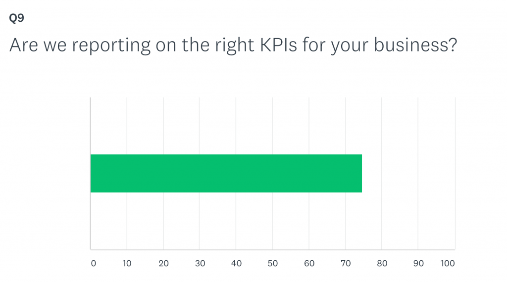
- Are we reporting on the right metrics? (e.g., which KPIs are most important)
- Are we reporting using the right segments? (e.g., audiences, campaigns, channels, sources)
- How often do you share reporting with others?
- How well does our reporting convey the value of our work?
Ask a combination of the rating scale and open-ended questions so that you can get enough qualitative feedback to design from and enough quantitative feedback to understand how your reporting is improving over time.
Center Reports on Answering Business Questions
One sure-fire way to lose faith with your clients and internal teams is to provide reporting that doesn’t answer our customers’ questions about the data.
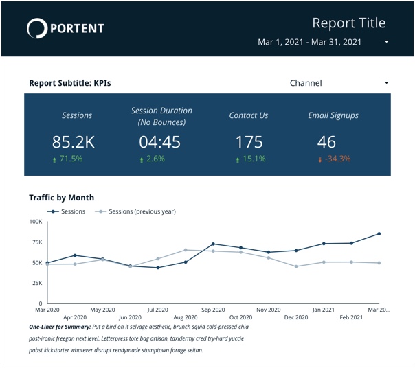
That’s why the first thing in our newest reporting template is a headline in the form of a question:
What question does this dashboard answer?
Under the question, we include a subheading that describes where the data comes from and what assumptions are baked into the numbers by default:
A year-over-year look at product page performance from Google Analytics.
Starting your reports here will make sure the rest of what you build suits a specific purpose and that everyone is on the same page about what they’re looking at before they see a number.
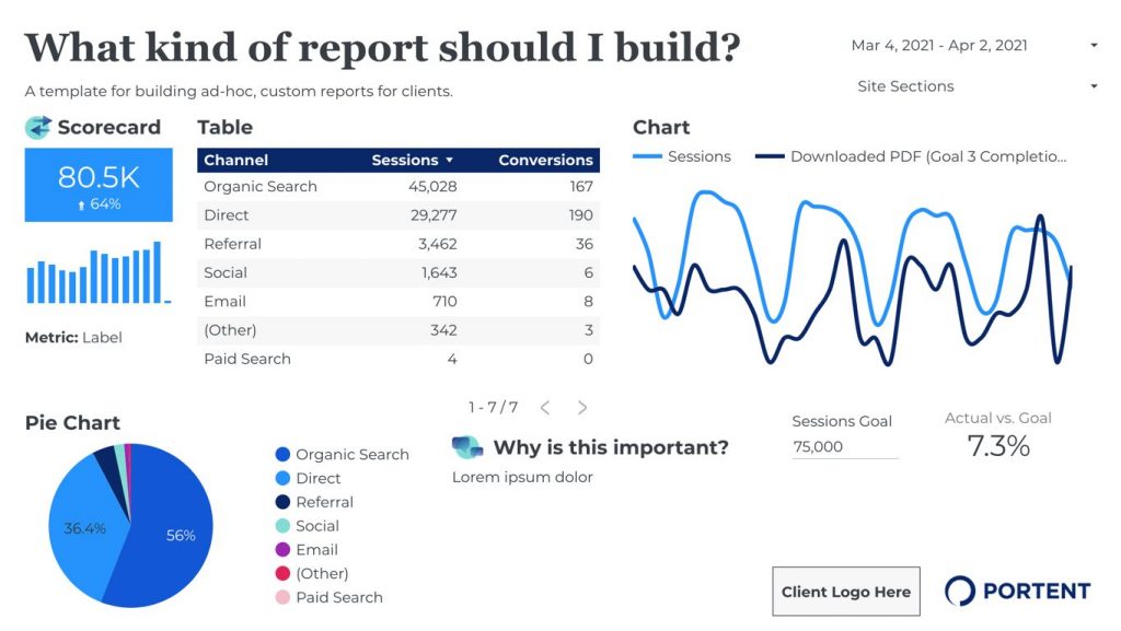
Build Reusable Components, Not Entire Dashboards
One early problem with report templates we created years ago is that they weren’t easy to modify when a new type of data became available or when a client asked for a different layout.
We could’ve avoided those pitfalls by using atomic design principles. Atomic design encourages, nay requires, you to start with small standardized components that can be assembled into groups that can become widgets and then entire dashboards.
Think of it as a library of report building blocks with an inherent style guide.
The template shown below may look like a fully-formed dashboard page. Still, it’s just a bunch of reusable atoms assembled into groups: A chart, commentary block, dropdown filter, heading, input field, label, pie, scorecard, sparkline, table. Each atom has design, spacing, and typography rules implied, but also allows for flexibility of use.
Context Is Everything in Reporting
Shareability of reporting hinges on dynamic context that can follow trends in the data as the client or team interacts with the date ranges in the dashboard. Data without context is almost useless.
To that end, our text narrative lives in a Google Sheet data source with columns for which pages in the report we’re explaining and the date ranges for which those narratives are relevant.
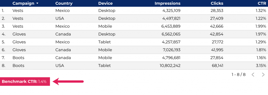
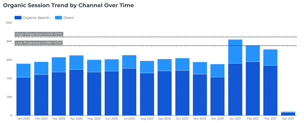
But text narrative isn’t the only form of context. Context also comes in the form of competitive benchmarks and goals. Recently, we’ve begun integrating those pieces into our dashboards to answer the business question: “Is this performance good?”
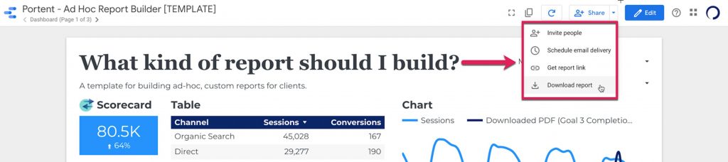
Report Delivery Should Be Malleable
A reason we’ve stuck with Google Data Studio over the years is it allows for ease of delivery in the formats our reporting customers are used to working with.
Not only can we link clients directly to the interactive dashboard (which is updated 24/7), but also snapshots in time that can be downloaded via .PDF, scheduled for email delivery (and piped into Slack channels from there), embedded via HTML in team intranets, and easily exported to .CSV for spreadsheet addicts.
Evolving Reports Over Time
The hallmark of a good data organization is how you evolve. Iterate on your reports often and incorporate the best modifications your team makes into the main reusable template. Even if the opinions of leaders drive your initial designs, individual contributors will always come up with the coolest innovations in how they apply the template.
Share your works in progress early and often with clients. Don’t be afraid to launch a new version of your report 75% baked. They will provide feedback as you’re building to make sure you don’t paint your templates into a corner.
Most importantly, don’t be afraid to challenge your assumptions about what reporting should be. The tool you use can be anything – GDS, Power BI, Tableau. The design you use should serve you and your clients instead of the other way around. When nothing is sacred in reporting, anything is possible.