
Reporting can be a chore. Even with all the data automation in the world, to frame our results, we feel the need to write an executive summary and hope we touch on the why behind all the painstakingly-created charts and graphs.
But sometimes, we might not be able to boil down the proper context for the client in just those few introductory paragraphs. So let’s explore some simple ways to have the data elaborate on itself.
Annotations
Annotations can be as simple as “campaign starts” with an arrow pointing to a place on the timeline.

They can also be as simple as a caption under a point in the graph you want your client to pay attention to.
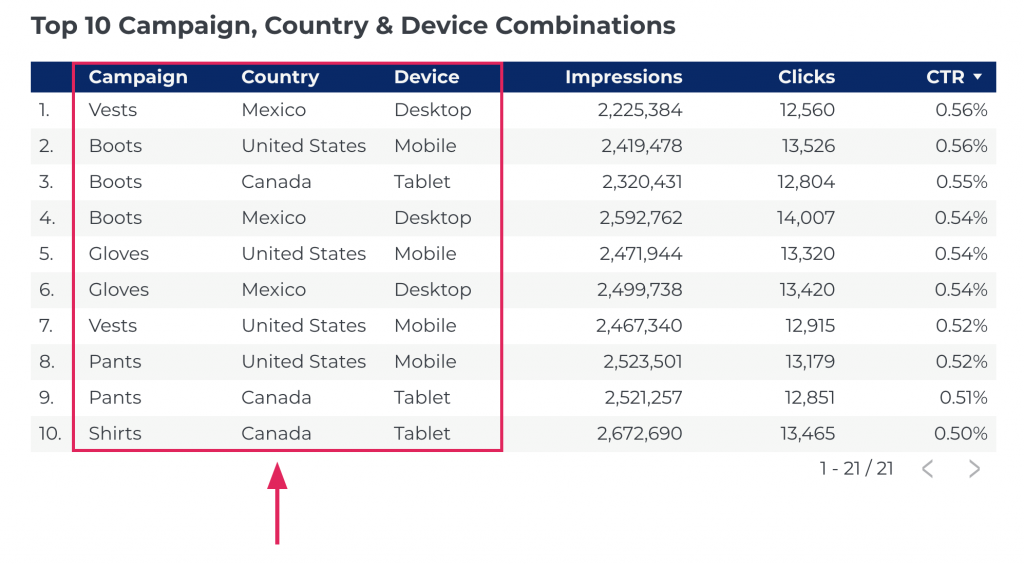
Secondary Dimensions
You have two pages in your report to address channel performance and landing page performance? Why not combine them? Adding two dimensions to one data table can frame a combination of things that lead to better performance and keeps the overall page count in your reports down.
Why not show campaign, country, and device while we’re at it?
Titles and Subtitles
I’m a big fan of teeing each page in the report up with a question in the title and answering it with the subtitle and the ensuing data. In the title and subtitle, you can lay out:
- Where you got the data
- What baked-in comparisons exist
- What business question you’re trying to answer with the report

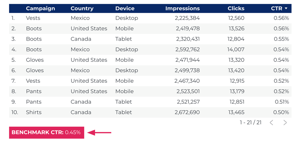
Benchmarks
How many of us have been in a client meeting and heard the question: “Is this performance good?”
Good compared to what? Their past performance or the performance of their competitors? In either case, as consultants, we should provide the answers and have them available quickly.
Ratios
Our clients’ conversions were up 20% over last month. Great! But was that just because they spent more money? Or just because they got more traffic? Or did we really drive higher conversion rates? Add the ratios alongside volume to have it there in case the question comes up.

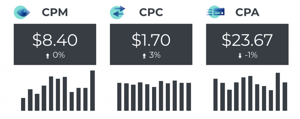
Cost
Like it or not, we live in an ROI-focused time. Never leave Cost Per metrics off of your report! Cost Per Everything: Impression, Click, Lead, Sale. If the client is going to have to answer to their CFO for how much they’re spending on customer acquisition, give them Cost Per every step of the acquisition funnel.
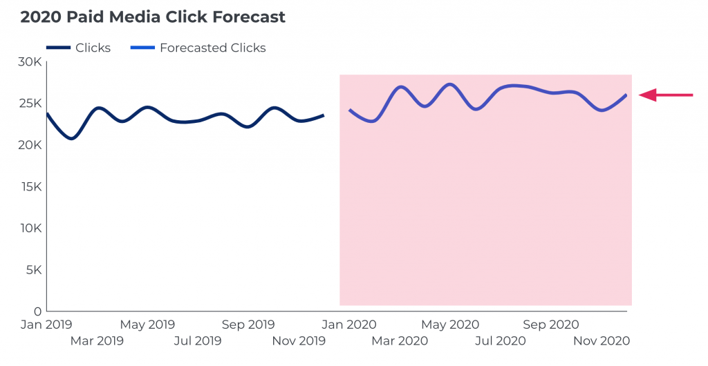
Trendlines and Forecasts
We can’t predict the future, but there are several forecasting models that come pretty darn close. These forecasts can help clients estimate results, which makes it easier for them to write our campaigns and marketing costs into their budgets.
Context, Not Writing
If we can’t figure out how to provide the context in our reports without writing a novel of an executive summary every month, we’re gonna spend an awful lot of time writing summaries and answering questions. So try some of these to create contextual utility in the data visualizations you already provide. And if all else fails, change the chart type! Switch your pie chart back to a simple table and add several more metrics. Never settle on a visualization that can’t explain itself.


nice concepts, thanks for sharing.
Thanks for sharing this valuable information! It is very useful for me as a part of daily off-page seo activities.
Wonderful post.. Its very useful information..!! Thank you.
Thanks for all that valuable information!! I just want to say your article is very helpful, that’s very clear.