
While it’s generally not recommended to “ judge a book by its cover,” you can certainly judge an entire website by its homepage. In other words, your homepage can either encourage or discourage someone from doing business with you.
Homepages have two primary goals:
- Communicate the site’s purpose and value proposition
- Provide top-level navigation to additional information inside the site
If you’re unsure where to start or how to evaluate the current usability of your homepage, follow these tips and best practices.
1. Introduce Yourself
The homepage is likely the first page people visit on your site, so it’s vital to not only provide information regarding who you are and what you do, but what you can help someone achieve with your product or service.
First, you want to signal to users that they arrived at the right place by including a visible logo, typically on the top left corner of the page.
Next, make your purpose clear by showcasing your value proposition. One way to do this is by featuring a tagline that succinctly emphasizes what your company offers and how you differ from competitors.
Tips:
- Make sure your value proposition and purpose are clear and avoid using vague language or jargon.
- Don’t make it all about yourself; speak toward your users’ pain points and motivations. Think of it this way: No one wants to go on a first date with someone who only talks about themselves.
Examples of Good and Bad Value Propositions
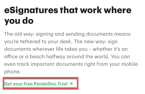
Pandadoc showcases its value proposition by clearly stating what they offer (electronic signature software) and why users need it (to improve the speed and security of documents).

However, if you saw this headline without knowing who the company is, could you take a guess as to what service or product they offer?

How about this statement?

“Lower your costs, save time, and elevate the customer experience” could probably be said by any SaaS company. While DocuSign is a well-known brand, they’re still trying to attract new users who may not know what “eSignature” means.
Using vague language becomes pure fluff and does not help users understand what sets your services apart and what you have to offer.
2. Feature the Most Important Content to Your Users
Often, I see clients feel the need to present everything available on the site for new users so that users can pick their own journey. However, this tactic often leaves users feeling overwhelmed or uncertain about what decision they should make.
Additionally, if you manage your company’s website, you probably get lots of requests from various stakeholders to feature what they feel is important to reach their users.
To drill down and evaluate what to keep and not to keep on your homepage, consider the following:
- What are most people here to do? Users typically come to your site with a goal in mind. This can be making a purchase, learning about your services or products, or seeking educational resources.
- What information do users need to achieve their goals? The information that helps users accomplish a specific task should be prioritized over everything else.
Ways to Determine What Your Users Care About
Google Analytics
- Start by looking at what pages users are visiting after your homepage. This will tell you what call-to-actions (CTAs) and navigation items users are most interested in.
- If your website has an internal search, analyze the keywords and search queries to spot themes.
Search Intent and Competitive Analysis
- If you know what search queries or keywords you’re after, you can identify common questions users are asking through rich snippets. This can help you craft messaging that directly speaks toward your users’ pain points and needs.
3. Simplify Your Hero Image
The header design is the very first thing people see on any given page; hence, it’s the most important real estate of a page. When designing your hero banner, follow minimalist design principles by leaving enough white or blank space for people to digest the information.
Follow these best practices for hero banner design:
- Avoid giving users too many options at once. Provide no more than two primary CTAs.
- Ensure your hero banner follows accessibility guidelines for readability. Pay close attention to the color contrast of text and background; the higher the contrast, the more legible the text.
Example of a Good Hero Banner
Unity Gaming has a simple yet effective hero image. Using a solid, static background draws a user’s attention to the headings and primary CTA button.

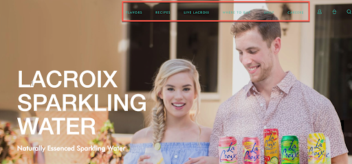
Example of a Hero Banner That Needs Improvement
La Croix’s hero banner is also the background to their site’s global navigation. This is problematic when the background image has various colors that make the navigation labels difficult to read.
4. Use Descriptive CTAs
People are more willing to engage with a website and take action if they know what the outcome of that engagement will be. To improve your UX and make your site more accessible, ensure that any CTA, link, or anchor text accurately describes the information users will expect to find upon interacting with the link.
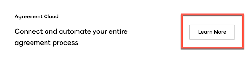
Go ahead: Update all of the “learn more” CTAs on your homepage right now.
Additionally, assistive technology is able to find all links on a page and present them to users. When read on their own, links labeled as “Learn More” are not helpful to users.
Example of a Descriptive CTA
Example of a Vague CTA
5. Get Rid of Stock Imagery
Whenever possible, try to use original content. Showing photos of real people, product features, or services will position your brand as more authentic. Users are more likely to trust brands when they appear real. Also, stock images can often come across as duplicative and can harm the user experience when users continuously see the same type or style of image over and over.
For example, rather than using a stock image of a restaurant, Toast features an image of their software to showcase their product.

6. Ensure the Search Field Is Findable
If your site has internal search functionality, it’s essential to place it where users expect to find it. One of the most common locations for a search box is at the top right corner of your site.
Follow these best practices for designing a search box:
- Use a simple, magnifying glass icon—the more simple, the better for recognition.
- Display the full open-text field, so the search option is more noticeable.
- Include a button separate from the open-text field so users can easily identify where to click.
- Ensure the search box is on every page.
- Make the search box support longer inputs.
7. Avoid Pop-Up Windows
Out of all of the pages on a website, the homepage should be the last one you consider putting a pop-up screen on. Most users instantly dismiss pop-up screens as they automatically think they’re ads, or task-oriented users don’t want any distractions.
Once a user closes the pop-up, they can’t retrieve the information. Instead of a pop-up, place vital content for users in a place they can find it while they’re browsing through your site.
8. Go With Static Images vs. Carousels
Image carousels are distracting rather than helpful. And, designing an effective carousel is hard to accomplish. Nielsen Norman Group found that users often ignore carousels or find them excessive. Instead of using a carousel to feature multiple pieces of content, choose the most important item and make it your “hero.”(Now you can see why they call it the “hero banner.”)
When in doubt, keep it simple. Users are viewing dozens of websites a day on their phones and desktops. Every little thing that increases their effort to find what they’re looking for hinders their overall experience.
9. Iterate and Test New Ideas
Implementing good UX isn’t a one-time job. As our technologies evolve, so do our expectations and behaviors of how we wish to use them. It’s important to constantly test and iterate new ideas to leverage and validate your user research.
Making an investment to understand your users’ behavior and preferences will help you build more effective designs and provide the most useful content.
Final Thoughts Before You Redesign Your Homepage
To ensure users have a positive experience on your site, you should always have a pulse on how people engage with your homepage content.
Before saying “yes” to featuring new information, ask yourself, “Will this help users complete what they’re here to do or discover?” If the answer is clearly no, the homepage is likely not the place for it.


thanks for your valuable information, it is helpful.