
Though they say nobody likes a critic, there is something to be said about how much value constructive criticism can add. Good UX relies on customer and audience input to continually improve products, services, and experiences. Luckily, A UX writer can translate the user’s needs into actionable changes to improve the user experience.
Of course, it takes more than looking at a website, an app, or a point within a process and aimlessly making adjustments in hopes that it will fix a wide array of issues. It requires thorough knowledge of the company, product, brand, and most importantly: the user. Here at Portent, we do exactly that. Before we dive into principles and examples, let’s cover how we define and execute UX writing.
What is UX Writing?
UX writing is the practice of creating copy for alerts, CTA’s, navigation, and every element you see on a page to help nudge users through a digital experience. Whether a user fills out a payment form, lands on a service page, or views a shopping cart, a UX writer’s role is to proactively find opportunities to reduce friction points and move the user further down the marketing funnel.
If there is a roadblock on the user’s side that prevents them from seamlessly accomplishing a task, it poses a threat to the business’s goal as much as the user. The bottom line is that if a digital process is broken, neither the user nor business can benefit.
The Four Major UX Writing Principles
UX’s goals depend on the project at hand, but it is vital to follow UX best practices no matter the business, product, or platform. Although there are various ways to approach UX writing, most writers stress that for content to be effective, it must be purposeful, conversational, concise, and consistent.
1. Be Purposeful
When it comes to good UX writing, the content on a page must serve a clear purpose to the user and provide information necessary for the user to know without leaving the page. Since 79% of users are scanners, it’s essential to position the content with the highest priority toward the top of the page. Users should be able to get the most critical information right off the bat, or they may bounce off your website to find it elsewhere.
2. Be Conversational
Creating a conversational experience does not require adding personality for the sake of it. Instead, use a tone of voice that leaves a positive impression on the user when the process is mundane or could cause irritation (such as a user getting locked out of an account or entering incorrect credit card information into a form-fill).
Keep in mind that there are nonverbal ways to communicate with your users as well. Color, typography, and spacing can express brand personality and mood, which is just as important when making a digital impression.
Not sure how to make your copy more conversational? Think about how you would explain the process you want your users to go through to a friend or family member.
3. Be Concise
Although it might take a lot of copy to inform the user and make it personable (such as a complicated product), you might not have the space to fit it on the page. There is a time and place to be descriptive and creative, but it is imperative to respect the user’s time and attention span when it comes to UX.
Too much copy can overwhelm the user, but too little copy can come off as cold, bland, or unhelpful. To achieve this delicate balance, each word, sentence, icon, and punctuation mark must be carefully selected.
Ensure that your content is concise and to the point as long as the user’s needs are met first. The key is only to include vital information that is easy for a broad audience to understand (without too much fluff or jargon).
4. Be Consistent
Once you have established content that is purposeful, conversational, and concise, it should be applied to all aspects of the website throughout the user journey. As mentioned earlier, a good user experience removes friction. If the elements on a page are inconsistent, it will not illustrate a seamless experience, and backtrack on the hard work you put into the copy’s design, content, and personality.
It is essential to consider all four principles when you create content for a good user experience. However, it’s also important to keep in mind that not all principles always work together. For example, if there is limited space on a page, conciseness must be the top priority—and so on.
Examples of Poor UX Writing
Every icon, word, color, and layout play a role in a user’s experience. Just looking at one small element on a page shows how the four principles are kept in mind throughout the design process to meet user and business goals. Let’s walk through a few examples of how UX writing could be improved.
404 Page Copy
Broken links happen, and it is often outside of the UX writer’s control. Although a UX writer cannot fix the broken link, it is up to them to create a 404 error page that can soothe the user when they arrive at the page.
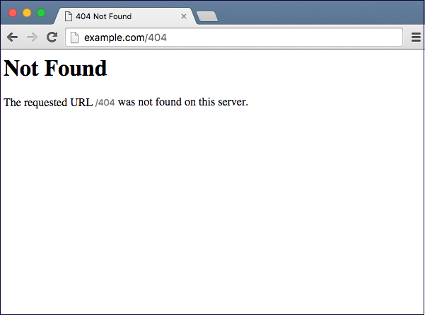
The principle this example does convey is conciseness since it is brief and to the point. However, this page does not contain the valuable information a user needs to understand what went wrong or where to go next, which does not fulfill the purpose of the alert. It is also lacking conversational tone and comes off cold, robotic, and looks broken.
To make this stronger, a UX writer could:
- Add more context to why the user landed on this page instead of the one they intended.
- Add conversational tone to take the blame off the user, so that they do not think they did something wrong.
- Add a CTA to get the user back on track, by sending them to a page with additional troubleshooting information or back to the homepage.
Aside from these quick tips, here’s some more information on how to create a great custom 404 page.
Instructional Copy
Next, let’s take a look at the online instructions for purchasing or refilling a bus pass for use on Seattle’s public transportation system.
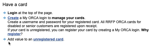
If you need to buy or add money to a bus pass, it is important that the customer is informed of their options to guide their purchase. Although ORCA does include the necessary information, it lacks consistency and human touch. This comes off as robotic, unhelpful, and outdated. The fact that the links and bolded text are inconsistent isn’t just a usability error; it also creates confusion and limits intuition. By clicking on a button that says “register,” a user would expect to land on a page that enables them to register a card. Instead, it takes them to a page dedicated to learning why ORCA recommends registering a card.

On this page, the user has to scroll more than halfway down to find out how to register a card, and the anchor text “start here” lacks enough context for screen readers to pick up.
In order to make the registration page stronger, a UX writer could:
- Add a question mark to the title of the page, “Have a card?” to make it more conversational.
- Create consistent hyperlinks with detailed anchor text so that the user can expect where to end up on the next page.
- Prioritize information and options the user needs to know off the bat toward the top of the page. A user who lands on the page “get a card” is looking to either add money to an existing card or purchase a new card. These two options should be easy for the user to find and act on without much thought.
Examples of Strong UX Writing
Now that we’ve looked at some examples of how to improve poor UX writing elements, let’s dissect how two different companies, Massage Envy and Nordstrom, use successful UX writing in their alert banners, and how they incorporate each of the four major principles.
An alert banner is like a voicemail. A good voicemail provides necessary information while being short and to the point. They should have a conversational tone and be consistent with how they would talk to you in person.


Purposeful
Massage Envy and Nordstrom each use alert banners to inform the user about entirely different information, even though both of these screenshots were taken on the same day and under the same circumstances (a global pandemic and Black Friday weekend).
Massage Envy’s purpose is to inform users on health protocols since their business relies on in-store visits from customers, and they want them to feel safe and prepared for their visit. They use their alert to answer questions users have before asking to eliminate second thoughts or hesitation when scheduling. It communicates safety and proactiveness.
Nordstrom’s purpose is to inform customers on current cyber deals since it is relevant and time-sensitive to the user. Although Nordstrom does experience large amounts of in-store shoppers, they know their users’ needs can be met online.
Conversational
The language used in each alert flows naturally and does not sound robotic. Instead, each could be read aloud by a salesperson (or front desk associate), and you would not be able to notice a difference.
Concise
Both Nordstrom and Massage Envy use concise messaging that gives users the necessary information in less than 20 characters, with an option to cut to the chase and “shop now” or dive in deeper and “learn more about protocols.”
For Massage Envy, being concise when talking about the pandemic prevents the user from being overwhelmed (which goes against their relaxing persona). For Nordstrom, too much copy keeps the user reading when they should be shopping.
Consistent
When you walk into a Nordstrom or Massage Envy, there is an expectation for how your experience is generally going to go. Although both experiences would be vastly different from one another, there is an expectation that you would be greeted with the information once you enter. The same thing goes for a website. These examples also follow established industry conventions by placing them at the top of the page so a user can expect that it is important information to know before continuing on their journey.
Both brands use a voice and tone consistent with the rest of their branding, both online and in-store. Voice and tone get boiled down to the use of language, punctuation, and color. Colors like red often represent energy and excitement, but according to a study by the University of Rochester, people react faster and more forcefully when exposed to red because it creates a sense of danger. In this case, the same color can aid one business’s goal and hinder the other’s.
Nordstrom uses the color red to invoke a sense of urgency with Black Friday shopping deals. In this case, they intend to catch the user’s eye and spark their excitement to shop. They know that it is unlikely to scare the user away using this bold color statement because their customer is used to this aesthetic.
On the other hand, Massage Envy chose to avoid the color red since the messaging deals with health protocols that can trigger their customer, even if the messaging is safe and reassuring. They stay true to their brand’s tone, which is soothing and relaxing. They know that the last thing a user wants when planning a massage is to feel alert, threatened, or scared.
These principles are helpful on their own, but each comes together to create a successful alert banner, page, and experience.
The Wrap Up
UX writers’ goals are to avoid friction, fix broken processes, and leave the user with a smile, a sense of delight, and an excellent overall experience. In some cases, it will be very evident when a website or an app has poor UX, but good UX can be subtle.
Are there any times you have gone through a process that resulted in frustration and even caused you to leave the page? Or, have you appreciated a personal touch on an app that has converted you to a repeat consumer? Good UX is rarely by coincidence, but has taken careful considerations of purpose, brevity, and personality to accomplish business goals through user insight.
The next time you interact with a website or an app, think about whether these four UX elements are present or what you might change to make the experience more intuitive. The best way to help improve UX is by recruiting participants and interacting with the product yourself to see where users get stuck. By understanding the user’s frustrations, goals, and mental processes, UX writers can make necessary changes that can elevate the experience and help businesses meet their goals.


