
Pi Day, the quirky math holiday, nay, the cultural phenomenon arrives once a year on March 14. Mathematicians celebrate the beautiful oddity of a number with a seemingly infinite number of numbers. The general public eats pie. And marketers have their own pie to consider: Pie charts.
However, while mathematicians agree on the beauty of pi, and the general public agrees on the deliciousness of pie, marketers and data visualizers do not agree on the effectiveness of pie charts.
What makes this humble, out-of-the-box data visualization that we all learned about in elementary school such a divisive chart? Regardless of how you recently celebrated Pi Day, in this post we’ll honor the holiday by exploring the benefits and shortfalls of pie charts, using the most appropriate set of data to illustrate examples: favorite pie flavors.
Benefits and Shortfalls of Pie Charts
Despite the ease of creating a pie chart, they’re often not very effective at communicating data. As a rule of thumb, when you design a pie chart, keep this in mind: how easy is it to understand what the top three results are?
Benefits
Two benefits of pie charts are that they are relatively universal and that people understand the concept. You don’t need to explain to your audience how the chart should be read. They also understand that the chart should communicate that all pieces of the whole should add up to 100%.
Others claim that they are useful for comparing angles rather than area, and that when faced with a side-by-side comparison about expectation versus the result, it’s easy to see when a pie chart slice is greater than 25% or 50%.
Shortfalls
Several elements make this out-of-the-box pie chart difficult to comprehend.

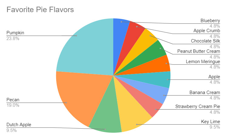
For one thing, it isn’t very easy for people to distinguish between the slices of the pie chart if they are similar in size. Take the two biggest pieces of the pie – Pecan and Pumpkin. Which slice is bigger? Or comparing Dutch Apple and Key Lime, which holds the rank of third-favorite pie flavor?
This brings us to the second element: color. What do these colors mean? Are they representative of anything? Aside from missing the mark on web accessibility for colorblind users, it’s unclear what, if anything, these colors should represent.
The lack of clarity of colors and size of slice speaks to the need for labels. The slices, as well as the portion of the pie they represent, should be clearly marked. Despite the added labels, you’ll notice this chart still takes some comprehension and time to identify the top three pie flavors.

Additionally, the slices of the pie should equal 100%. If you’re working with data where there is overlap and the total value is greater than 100%, a pie chart is likely not a good fit.
Finally, a pie chart can be further distorted with 2D versus 3D formatting options. The 3D option might look fancy, but it distorts the visual so that the bigger slices may look smaller, and vice versa. Stick to 2D pie charts to maximize comprehension of these charts.

What to Use Instead of a Pie Chart
If you’re struggling to make a pie chart that is an effective representation of the information you’re trying to convey, consider this alternative to visualize data that might get your point across in a more efficient way: a sideways bar graph.
This is a common alternative to pie charts. It is a quick visual that shows the top three pie flavors at a glance, and the actual values of data, rather than being a portion of 100%.

Here, we see that Pumpkin is the frontrunner, Pecan is a close second, and that Key Lime and Dutch Apple are actually tied for third place.
If You Must Use Pie Charts
If you’re a pie chart aficionado and insist on using them, here are some tips to make them more comprehensible.
Use Labels
As we saw earlier, the addition of labels provides clarity of which values are ascribed to each slice. This takes the guesswork out of wondering about the sizes of slices.
Put The Slices in Ascending Order
Putting the pie chart in ascending/descending order removes another element of guesswork – Understanding the order of pie slices. Here, we can quickly tell that Pumpkin is the most popular pie flavor, Pecan is the second favorite pie flavor, and Dutch Apple and Key Lime are the third favorite pie flavors.
Remove Unnecessary Colors
The pre-prescribed colors of this pie chart add another level of potential confusion. Do the colors mean anything? Are all “fruit” pies intended to be one hue, and “chocolate/other” pies meant to be another?
If colors aren’t adding meaning to your chart, simplify it by removing them, or using an abbreviated color palette to highlight the meaningful parts. This helps support the original goal of understanding the top three pie flavors.

In Other Words
Pie charts are not something to avoid altogether; however, they should be used with appropriate data. And when creating pie charts, formatting should be considered to make them easier to read, no matter how you slice it. So yes, you can have your pie chart, and use it in reporting, too.


