
One of the biggest challenges when designing a website is figuring out how to encourage users to take the actions you want. While we can’t force our website users to take a specific route, we can use a design element known as a call-to-action (CTA) to guide them down specific paths.
CTAs are one of the most powerful elements to get users to take action on your website. Since a good CTA can be the difference between making a conversion and losing one, it’s essential that they are both user-friendly and accessible so they can be as effective as possible.
What is a CTA?
A CTA refers to a design element that prompts users to take action, such as sign up now, add to cart, start a free trial, etc. CTAs appear in many different places on a website, from the homepage, to product pages, to landing pages, and more. They allow marketers and designers to focus the user’s attention and lead them to a specific conversion.
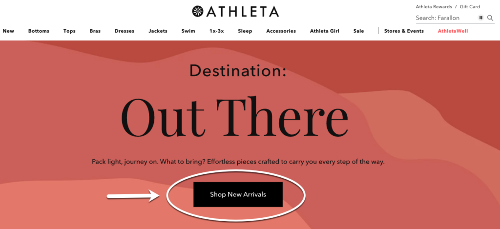
In the example above from Athleta’s homepage, the primary CTA is the black button in the center of the page, with the text ‘Shop New Arrivals’. The verb ‘Shop’ defines the specific action Athleta wants users to take and ‘New Arrivals’ explains what they want users to shop for. This CTA visually stands out on the page and is designed in a way that makes it obvious this is the next step for a user to take on this page, thus encouraging users to select the button and shop their new arrivals.
Why You Should Consider UX & Accessibility When Designing CTAs
User Experience (UX) is all about understanding the user’s needs to create a positive and easy-to-follow experience. Web accessibility focuses on making sure websites are designed and coded so that people with disabilities (and/or people using assistive tools, like screen readers or voice-over) can use them.
UX and accessibility go hand in hand as they are both about putting the user first and making sure products are created with their needs in mind. Considering these two aspects when designing your CTAs will benefit both your users and business goals.
Better Experience for All Users
By understanding the user’s journey and what design elements will make things as easy as possible for them, you can make sure your CTAs seamlessly and intuitively fit into the user’s overall experience.
When you create accessible CTAs, you are opening your content up to more users and making sure your users who are disabled can also have a positive user experience. One of the great things about accessible website elements, like CTAs, is that they are beneficial for all users regardless of who your target audience is. Accessible website elements can help people who:
- Browse websites using devices with small screens, such as a phone or a tablet
- Undergo mobility changes due to aging
- Experience temporary disabilities due to an injury
- Experience situational limitations based on their environment, like bright sunlight or slow internet
More Conversions
CTAs are a crucial step in conversions and moving users down the marketing funnel, so it’s important to design them in a way that will be the most effective for all users. If your CTAs are not user-friendly or accessible, you will miss out on conversions.
For example, if someone is using a screenreader and is tabbing through each of the buttons on the page but they all have a vague CTA that says ‘shop now’ or ‘learn more’ with no context, that person won’t know which button to select and as a result, won’t convert.
Improves SEO Performance
In terms of SEO, when a website is built and designed with accessibility top of mind, website crawlers can better identify what the content is about since there is more context and labeling included. As a result, the content can rank better.
To create the most effective CTAs, you need them to stand out on the page and provide value for your users. UX and accessibility best practices can help you do just that. So let’s jump in.
9 CTA Best Practices for UX & Accessibility
These best practices range from what the CTA says, how it looks, where it’s placed on the page, what interactive elements it has, and more. By optimizing each of these aspects you can create an effective and accessible CTA that will help you improve engagement and, ultimately, achieve your conversion goals.
- Use Action-Oriented & Descriptive Text
- Check Text Contrast
- Consider Use of Color & Visual Design
- Use Strong Hover & Focus Styling
- Prioritize CTA Placement Above the Fold (w/AIDA Model)
- Include Consistent Labeling & Placeholders For Forms
- Implement Selectable Blocks of Content for Secondary CTAs (Link Shielding)
- Consider Mobile Design
- Test Your CTAs (A/B tests)
1. Use Action-Oriented & Descriptive Text
When writing user-friendly copy for your CTA, active verbs are your friend. A vague ‘learn more’ is not very compelling for users nor is it accessible as it doesn’t provide enough context for users using assistive technology that looks at the links on a page.
By writing a specific and descriptive action, you can better capture the user’s attention and more accurately set up users’ expectations for what they will get by selecting your CTA.
CTA Example #1 — Descriptive Text
Let’s look at the screenshot below of Hello Fresh’s homepage. The primary CTA on the page is the green button in the middle of the page that says “View our plans”. If the CTA had said “Learn more” the user wouldn’t know exactly what content they would see by selecting the CTA button and might gloss over it. This vague text would also not meet accessibility standards.
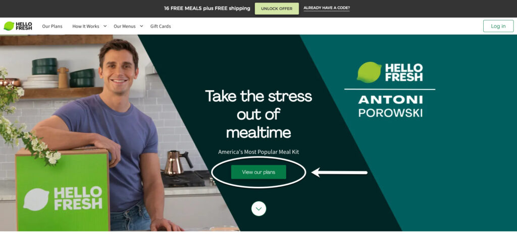
By using the specific CTA of “View our plans”, users can see exactly what value they will get out of selecting the CTA button — getting to see the plans. This copy is also more intriguing for users since it directly answers a main question users have when looking at a meal subscription service, what do the meal plans look like?
2. Check Text Contrast
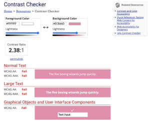
It’s important to consider the text contrast of your CTAs so users with visual impairment can easily perceive content on your page. Text contrast refers to the difference in brightness between the text and its background color. The ratio between these two colors has to be at a certain minimum to be accessible.
Web Accessibility in Mind (WebAIM) has an excellent Contrast and Color guide that explains the current Web Content Accessibility Guidelines (WCAG) two for contrast and color. WebAIM also has an incredibly helpful contrast checker where you can plug in the color code of the foreground and background to see if it meets accessibility guidelines.
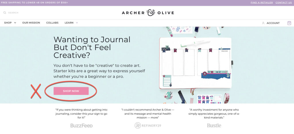
CTA Example #2 — Text Contrast
For an example of a CTA that does not have good color contrast, look at the screenshot below of Archer & Olive’s homepage. Their primary CTA button is light pink with white text that says ‘Shop Now’. When you plug in the color codes for that shade of pink and white, its contrast ratio does not meet the minimum requirement of 4.5:1 and it still doesn’t meet the required ratio when the text is presented at larger sizes.
3. Consider Use of Color & Visual Design
Your CTAs need to stand out on a page and draw users in. What colors you use and how you design the size and shape of your CTAs play a large part in making that happen.
Make sure to use colors that are accessible in contrast with your text color. It’s important to use colors for your CTA button that are different from your page’s background and aren’t used in many places on the page. That way, your CTA color is visually unique and stands out.
Your CTA button should also look different from your page’s regular buttons. This way you can use the visual design to help convey the information hierarchy that your CTA is the number one priority action for users to take.
When visually designing a CTA, don’t forget to consider how it will work with all of the other components on the page. You’ll want to have a good amount of negative space (or white space) around your CTA to help emphasize it.
CTA Example #3 — Color & Visual Design
Crate & Barrel has an example of a CTA that does not have a good color or visual design. The primary CTA button is a rectangular button in the middle of the page that says ‘Shop Sectionals’ with a transparent background so the image behind it is showing through. This CTA blends into the background, is difficult to read, and doesn’t visually stand out on the page.
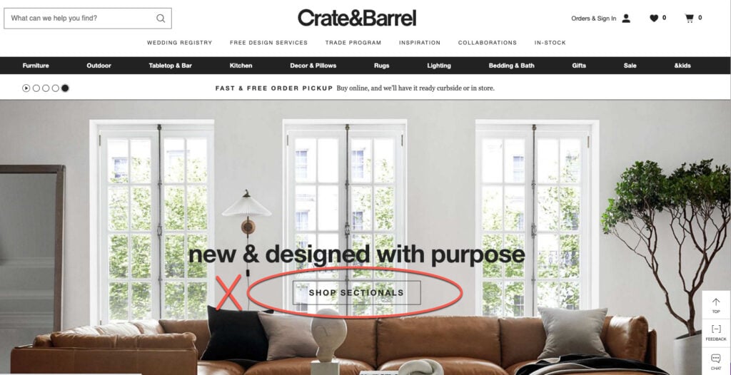
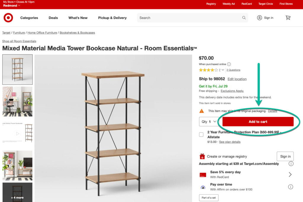
Target’s product page has a good example of a CTA button that uses their bright red brand color to draw attention to their ‘Add to Cart’ CTA. It is the only red button on the page and it stands out against the white background.
4. Use Strong Hover & Focus Styling
An excellent way to emphasize your CTAs is by giving them a strong hover feature and styling them in a way that draws focus.
Hover features are when a user’s cursor hovers over a button and the button reacts in a way to visually show that it is selectable. This interactive element could be adding a drop shadow to the button, underlining the text in the button, changing the background color of the button, etc.
CTA Example #4 — Hover & Focus Styling
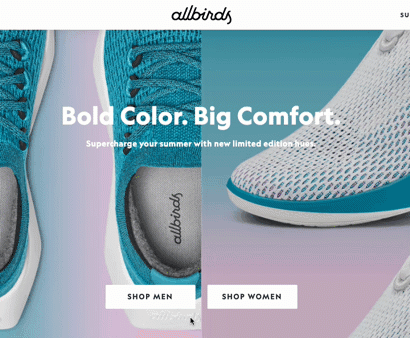
For an example of a strong hover feature, look at Allbirds’ home page and their primary CTAs to ‘Shop Men’ and ‘Shop Women’. When you hover your cursor over the CTA button, the button changes from a white background with black text to a black background with white text. This change in color really makes the CTA pop on the page and focuses your attention on the button since an action is happening there with the color change.
5. Prioritize CTA Placement Above the Fold (w/AIDA Model)
When figuring out where to place your primary CTA on a page, you have to consider your user’s journey through the page. You can’t start by trying to get someone to take action without first capturing their attention and creating interest and desire.
It would be like walking into a store and having an employee ask you if you want to buy a product right away without telling you what the product is, what makes it unique, and why it’s relevant to you. Similarly, in an online experience, the CTA step needs to come up at a natural part in the user’s flow through the page.
The AIDA model is a good framework to help organize the order of your content. AIDA stands for four stages a customer needs to go through before converting: ‘Attention’, ‘Interest’, ‘Desire’, and ‘Action’. In this instance, the fourth stage ‘Action’ is referring to our CTA.
Now that you have the order of your content, you’ll want to make sure your CTA is placed above the fold so users can see it without having to scroll down the page. It’s already difficult to capture people’s attention, so you want to make it as easy as possible for them to see your CTA without requiring any additional work. You could have the most amazing CTA button with the perfect copy but if it’s too far down the page and users don’t see it, it won’t do any good.
CTA Example #5 — Above the Fold & AIDA Model
Let’s look at Redbubble’s homepage. They do a great job of following the AIDA model, which you can see labeled in the screenshot below.
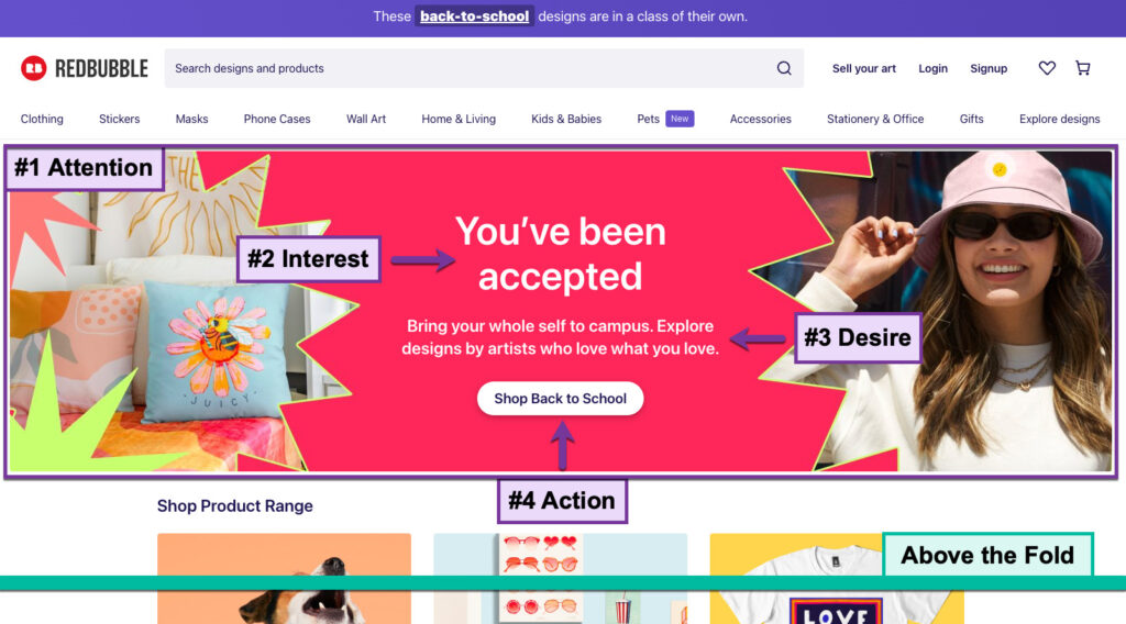
The big, colorful banner image immediately catches your attention. The next element that draws you in is the header “You’ve been accepted”. This piques your interest as it’s visually the biggest text on the screen, it talks directly to you by using the word “you’ve”, and makes you wonder what you have been accepted to. You then see the smaller text located under this header that says, “Bring your whole self to campus. Explore designs by artists who love what you love.” This generates a sense of desire for how your life will be better with Redbubble’s products.
The design then leads you directly to the primary CTA button “Shop Back to School” which tells you exactly how you can achieve this desired, better life.
These four stages are also all happening above the fold so you can see and experience this just by landing on the page without taking any additional action. You can really see how the thoughtful placement of a CTA can set it up for success and make it much more powerful.
6. Include Consistent Labeling & Placeholders For Forms
If not designed with UX and accessibility in mind, form CTAs that prompt users to enter information (like an email sign-up, payment form, contact form, etc.) can be extremely frustrating and difficult to fill out for everyone and especially for people with disabilities. The Web Accessibility Initiative (W3) has an in-depth tutorial guide on how to create accessible forms.
The key steps to take are labeling controls, grouping controls, form instructions, validating input, user notifications, multi-page forms, and custom controls. W3 explains the impact these design steps can have:
- People with cognitive disabilities can better understand the form.
- People using speech input can use the labels via voice command to activate controls and move the focus to different fields
- People with limited dexterity benefit from large selectable areas that include the labels
- People using screen readers can identify and understand form controls more easily since they are associated with labels, field sets, and other structural elements.
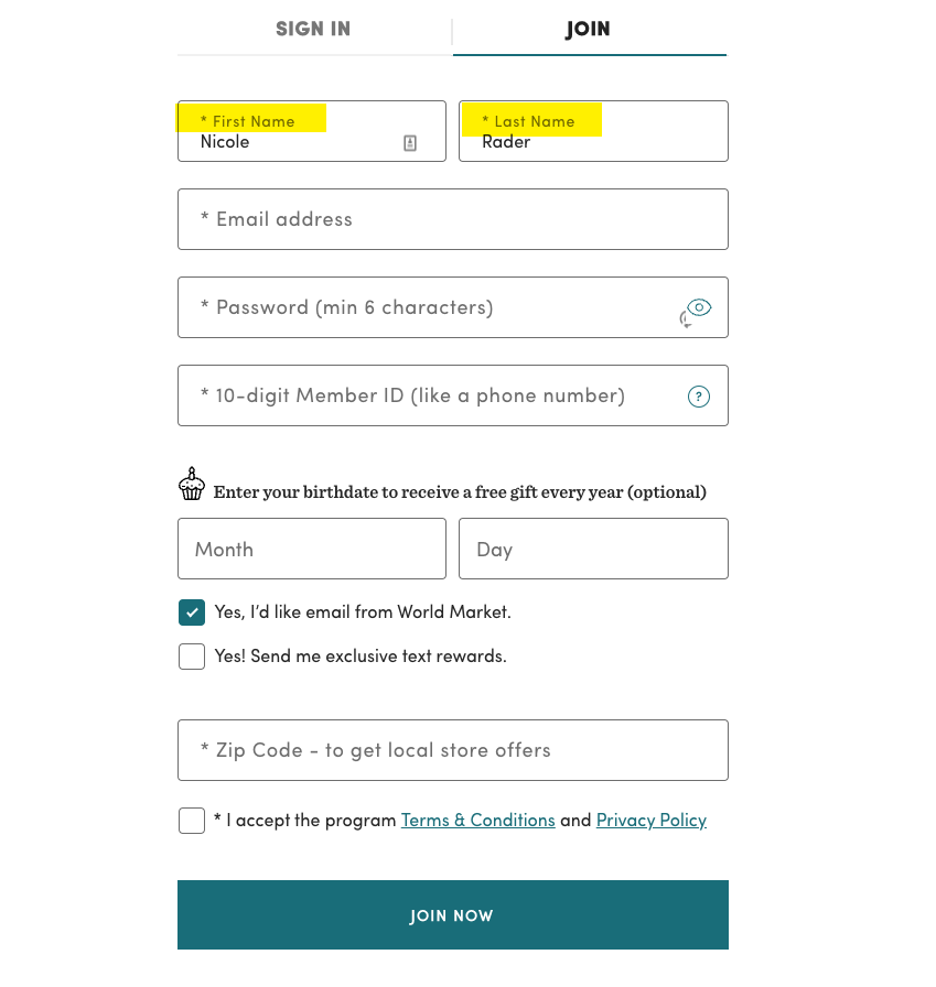
CTA Example #6 — Forms with Labels & Placeholders
For an example of a well-designed form CTA that is accessible, let’s look at World Market’s sign-up form on their website in the screenshot below. This form does a great job of including descriptive placeholder text to explain what specific information needs to be filled out in each field and in what format.
Another crucial element of this form is that when the user inputs information into a field, the placeholder text becomes a label for the field. You can see this highlighted in yellow in the example for the first and last name. This means when a user is inputting their information, they can still see the label for each field and not rely on memory alone that they have inputted the correct information for each field.
7. Implement Selectable Blocks of Content for Secondary CTAs (Link Shielding)
For your primary CTA to stand out, don’t clutter the page with too many CTAs that will distract users from the primary action you want them to take. A solution for a lot of these secondary CTAs on a page, like ‘Learn More’ or ‘Read More’ for additional resources at the bottom of a page, is to take away the vague CTA button and make the whole piece of content selectable with its title as the descriptive text. This is not only visually cleaner but it is also more accessible.
Having the entire content block selectable doesn’t require precise motor skills to select and the descriptive text will give users using assistive technology more context so they can know where this link will take them.
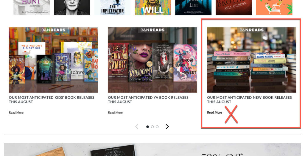
CTA Example #7 — Selectable Blocks of Content
Barnes & Noble’s homepage lists a lot of additional content for users to check out below the fold. In the screenshot below, you can see they have square blocks of content that link to different blog posts. For each blog post block, they list a ‘Read More’ CTA that bolds when you hover your cursor over it.
Instead of having this vague ‘Read More’ CTA repeating over and over on the page distracting from the primary CTA, they could remove the ‘Read More’ copy, and have the title of the blog post highlight and/or underline when you hover over it so the blog post title can be the descriptive copy a user can select.
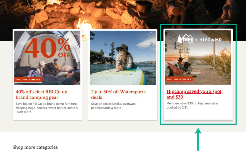
For an example of what more user-friendly and accessible selectable blocks can look like, let’s look at REI’s homepage. In the screenshot below, they have three blocks of additional content similar to Barnes & Noble’s page. However, REI does not include the CTA to ‘Read More’ for each block but instead has made the title of the content the descriptive text you can select.
In addition, when you hover your cursor over REI’s content blocks, a drop shadow is added to the whole block to slightly pop up the whole block and the descriptive title text is both underlined and bolded. These CTA blocks have descriptive text which is good for accessibility, they don’t have unnecessary vague buttons cluttering the page, and they have hover features that draw your attention to the content block and highlight that it’s selectable.
8. Consider Mobile Design
We live in a mobile-first world, so you have to design your CTAs so they will look and function on mobile as well as desktop. This means the mobile version of your CTA may need to change size and placement compared to the desktop version so it can still be effective on a smaller screen.
For instance, when designing for mobile with usability and accessibility in mind, you want to put your most important content in the center of the screen as this is where mobile users tend to look first. That is very different than how users interact with a desktop. Therefore, your CTAs need to take into account the different ways that people interact with mobile vs. desktop.
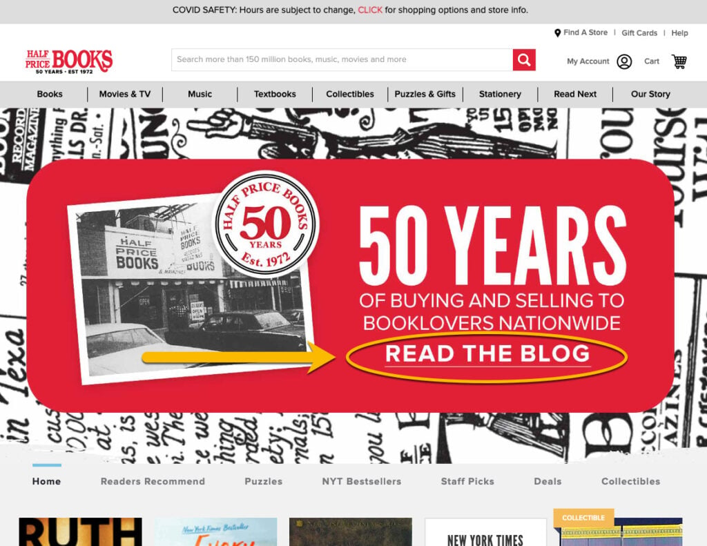
CTA Example #8 — Mobile Design
Half Price Books’ homepage is a good example of the importance of updating your CTAs for your mobile design. When you look at their homepage on a desktop, there is a large banner with the CTA to ‘Read the Blog’ that is circled in yellow in the screenshot below. The size of this desktop CTA text is much larger than any of the other buttons on the screen so you can easily tell it’s a priority on the page.
When we then look at the same homepage on mobile, the main banner from the desktop version has been shrunk down but not resized so the mobile CTA that says ‘Read the Blog’ is now smaller in size than the other navigation buttons. This makes the CTA very hard to read and feel like it’s not a priority on the page.
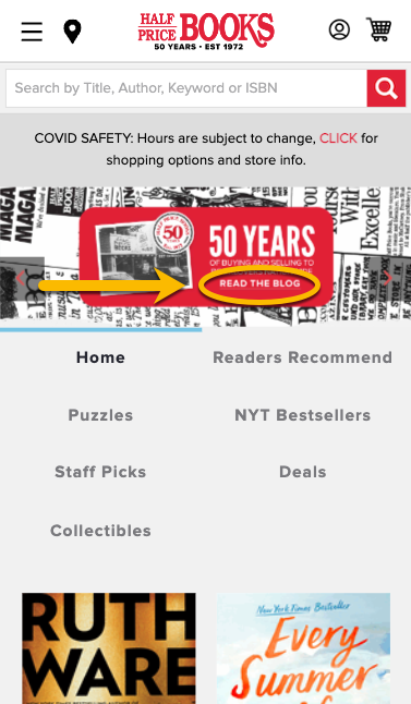
After looking at the desktop vs. mobile version of this homepage, you can tell It’s going to be a lot harder for the mobile CTA to help drive conversions since users can barely read it and it’s competing for attention with the navigation buttons. Be sure to consider how your CTAs look and perform on mobile as it makes a big difference.
9. Test Your CTAs (A/B tests)
Test out those CTAs! The best way to find out what resonates with your users is by testing different versions of your CTAs and getting data on what performs well. You can then iterate on your CTAs to create more effective versions.
When A/B testing your CTAs, remember to only change one element of your CTA at a time. If you have multiple elements that are different between version A and version B, you won’t be able to know which element resulted in the change in performance. For instance, you could change just the color between the two versions of the CTA, or just the text but you wouldn’t want to change both the color and text in one A/B test.
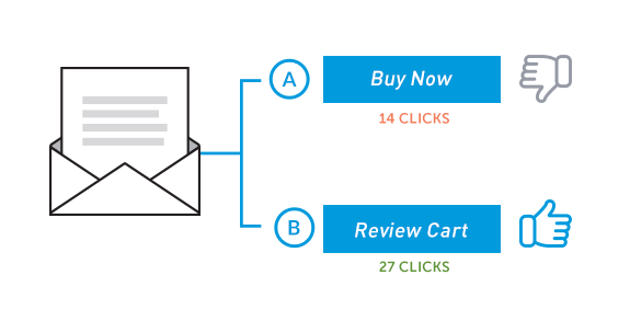
CTA Example #9 – A/B Test
In the graphic below you can see what an A/B test with two different versions of a CTA button might look like. Version A includes the text ‘Buy Now’ while version B includes the text ‘Review Cart’. By then showing half of your users version A and the other half version B, you can get data on which version of the CTA button performed better to decide which text to go with.
Wrap Up
By considering both UX design and accessibility with CTAs, you can create a better user experience for all of your customers and make your CTAs more effective at leading to conversions. I hope you found these best practices helpful and can apply them to your own projects.


